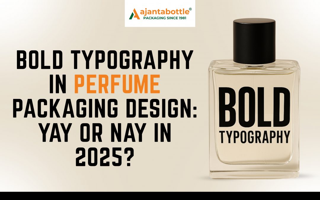
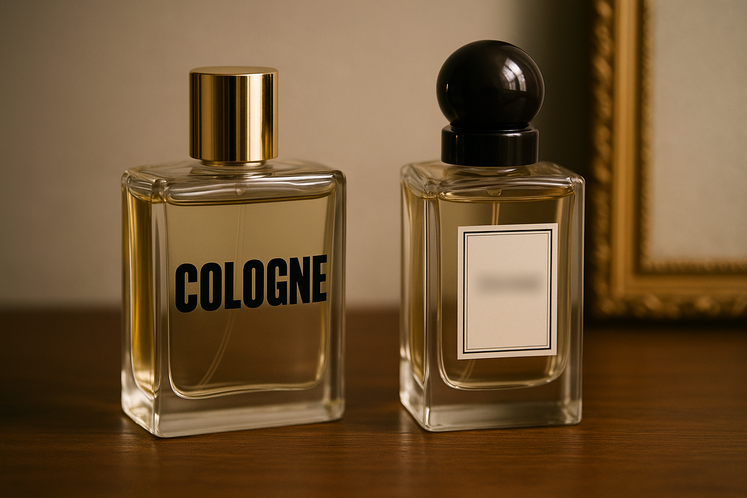
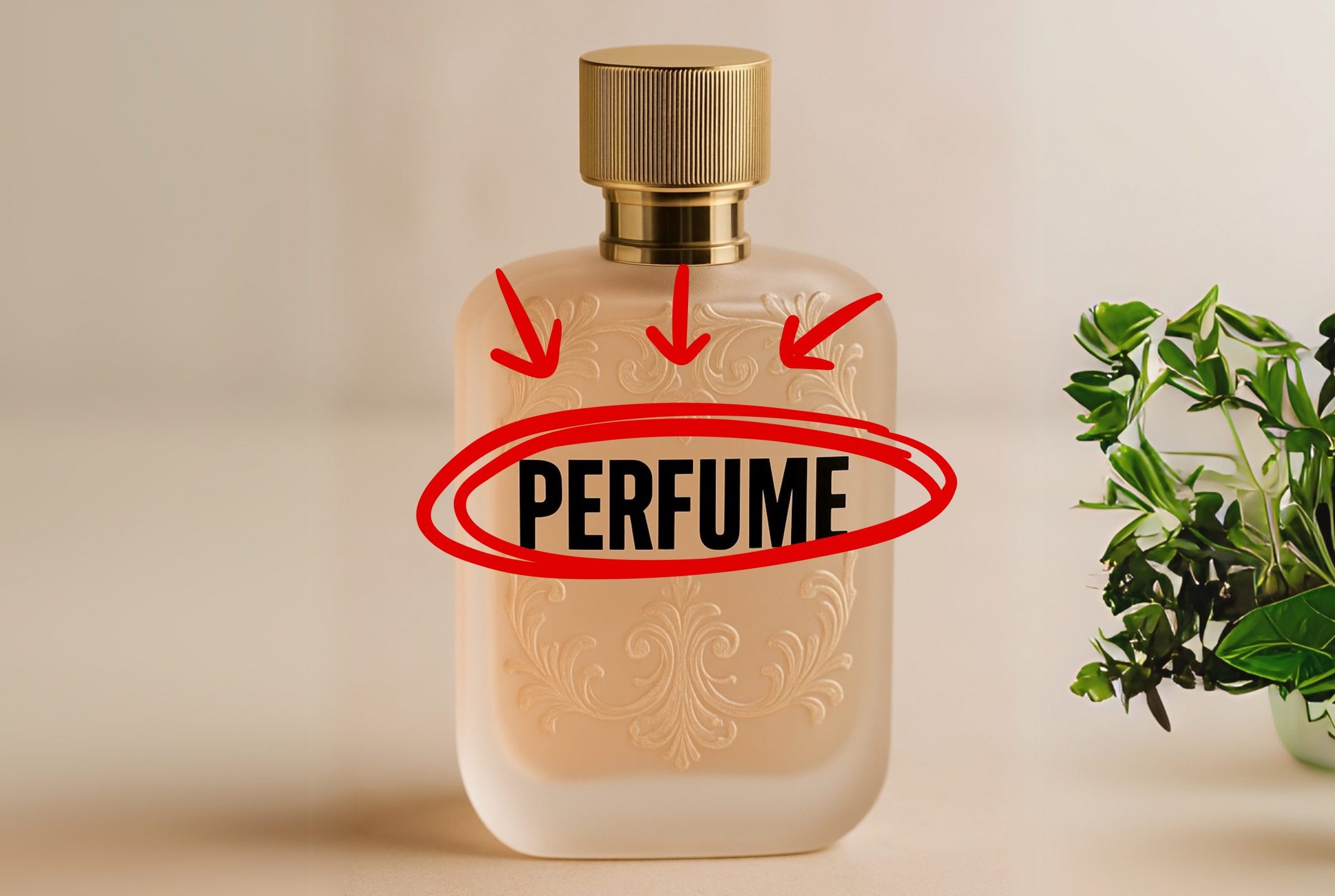
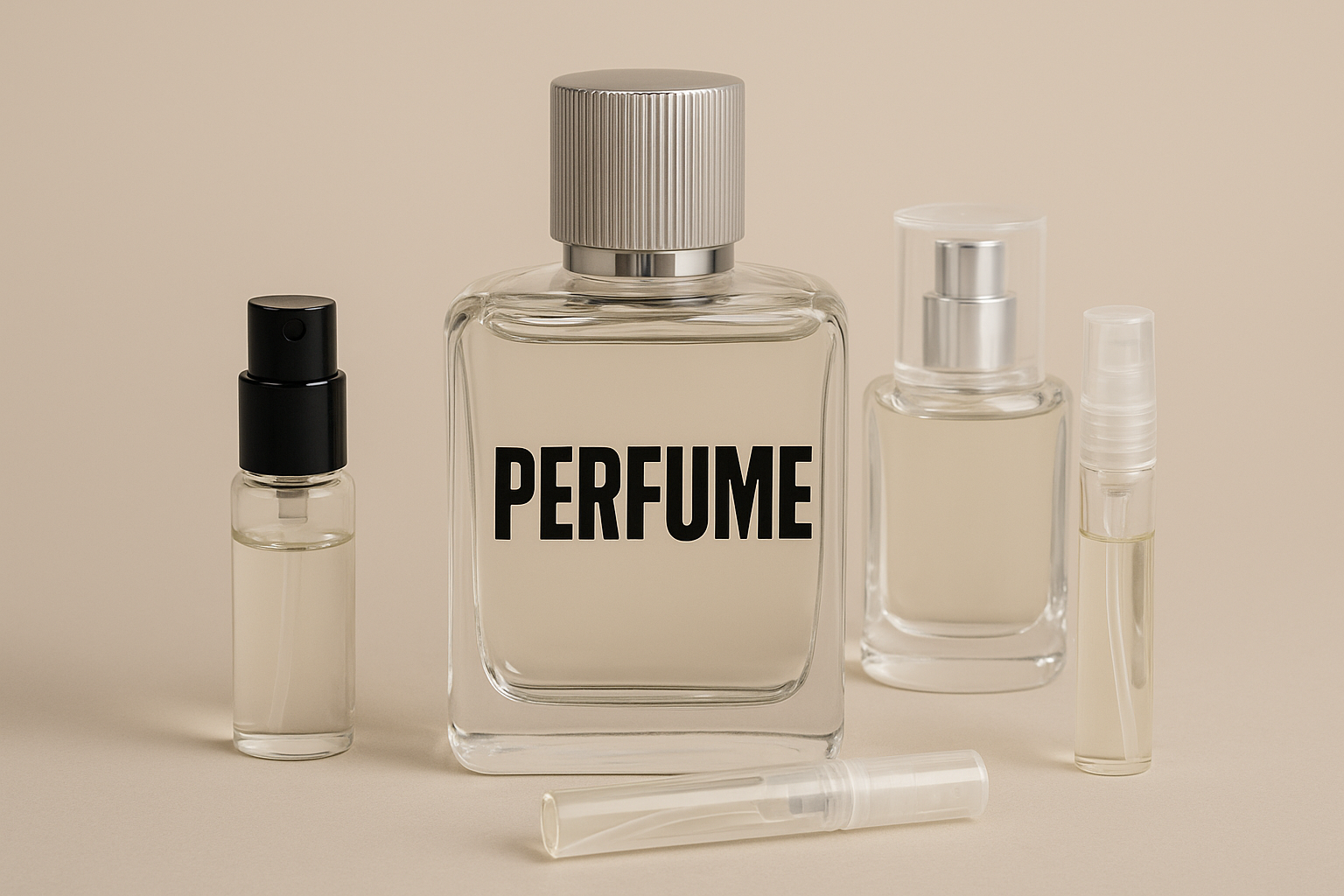
Before a drop touches the skin… before a bottle is opened… before a note unfolds… there is a word. A name. A label. And in that label lies a font—bold, delicate, or somewhere in between—that speaks before scent ever does.
Bold typography is no longer an edge-case experiment; it is fast becoming the visual signature of modern perfumery. But its rise also signals a crossroads for designers and marketers: should a product known for subtlety now wear fonts that shout?
This blog explores that question with data-backed insights, cultural contrasts, and strategic design thinking. At its core lies a simple truth:
Typography isn’t just seen—it’s felt, remembered, and trusted.
Bold is More Than a Font Weight—It’s a Design Philosophy
To understand the shift, we must first ask: what does “bold” actually mean in 2025?
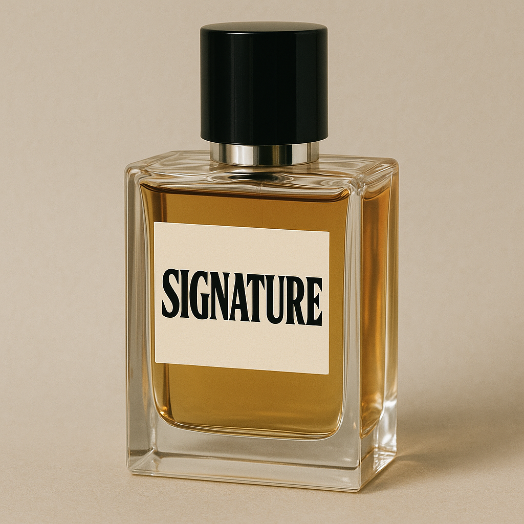
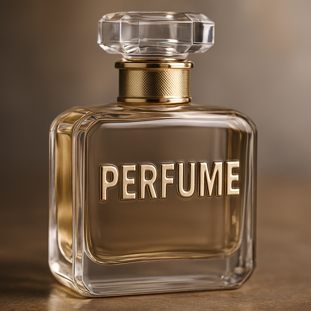
From a technical standpoint, it refers to fonts with thick strokes, heavy presence, and high visual contrast. But in branding, bold means something more emotional. It signals courage, modernity, and intention. It makes the name stand up and stay put.
And in an era when most consumers first discover fragrances via a mobile screen rather than a boutique shelf, bold fonts offer clarity at scale. What used to be decorative is now strategic.
Like a base note in a perfume, bold fonts ground the visual experience. They carry weight. They linger.
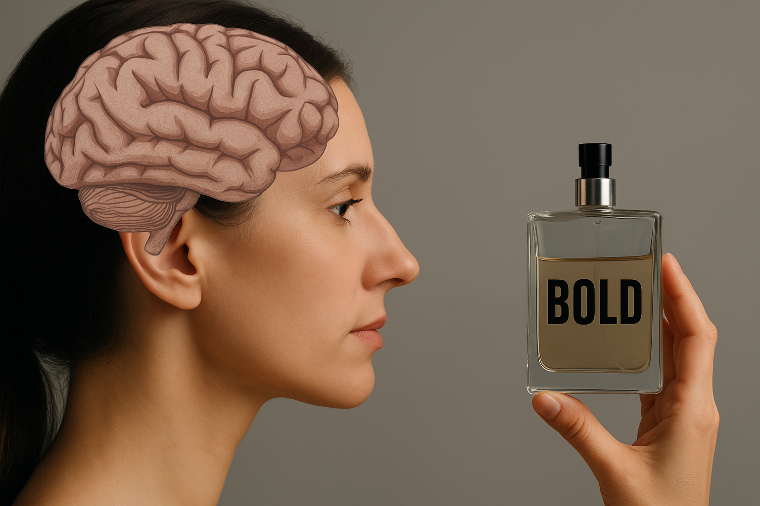
Consumer Psychology: What Bold Fonts Trigger in the Mind
According to the Global Font Use Survey (Monotype, 2024):
76% of designers favor bold sans-serif fonts for their clarity and digital adaptability.
Typography was considered the most influential visual element after color in packaging decision-making.
In a separate Nielsen test:
Products with bold, clean fonts had a 32% faster recognition time than those using light or script fonts.
Consumer recall improved by 29% when bold type was used for fragrance names.
Why? Because bold fonts cut through visual noise. In the age of swipe-speed decision-making, they act like design anchors.
Just like sandalwood or vetiver stabilizes a perfume’s top notes, bold fonts stabilize a visual identity.
But as Aisha Rathore, an Indian perfume designer, puts it: “Bold fonts are like base notes—you need them, but they can overpower the top if not handled with care.”
This is where nuance matters.
Design in Practice: When Bold Typography Works Brilliantly
Bold typography, when thoughtfully executed, becomes more than a visual choice—it becomes a brand statement that mirrors the fragrance’s mood and audience. Some 2024 launches exemplify this synergy between scent and style.
Zara Emotions by Jo Malone (2024 Refresh)
This collection adopted a clean, tall, bold sans-serif font, set against minimal black-and-white labels. The typography amplified the brand’s accessible luxury narrative. With generous kerning and vertical alignment, the font gave even smaller bottles a premium, editorial finish. It conveyed restraint, confidence, and timelessness—exactly what the scents promise.
D.S. & Durga’s “Deep Dark Vanilla”
This niche fragrance deviated from the typical vanilla profile, leaning into dark, smoky notes. Its packaging featured a condensed industrial-style bold font that matched its moody, resinous character. The type was centered and monospaced, delivering a brutalist aesthetic that aligned with the brand’s gender-neutral, story-rich persona.
Loewe Paula’s Ibiza 2024 Edition
Bold took a playful turn here. Rounded, vibrant, almost bubbly bold type was used to echo the citrusy, beachy, feel-good tone of the scent. This font, possibly custom-modified, felt youthful and fluid—optimizing both shelf visibility and social media appeal.
These examples share several best practices for using bold typography effectively in fragrance packaging:
| Brand | Font Function | Visual Strategy | Scent Reflection |
|---|---|---|---|
| Zara x Jo Malone | Signaled modern luxury | Tall, narrow bold sans-serif on stark background | Clean, minimalist, everyday elegance |
| D.S. & Durga | Conveyed intensity and mood | Condensed bold with harsh contrast | Smoky, dark, gender-neutral |
| Loewe Paula’s Ibiza | Celebrated playfulness | Rounded bold fonts with pastel tones | Bright, youthful, summery |
Where Bold Typography Fails: When Fonts Overstep the Fragrance
While bold typography brings visibility and impact, not every fragrance benefits from such volume. Some scents are composed to evoke intimacy, softness, or nostalgia—feelings that are easily disrupted by typefaces that are too loud or too assertive.
1. When Typography and Scent Personality Clash
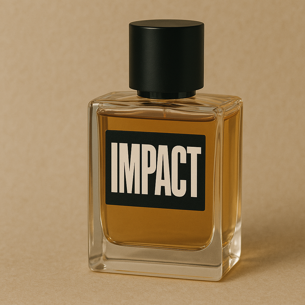
A powdery floral with romantic notes like iris, peony, or violet often aims to create a sense of tenderness or femininity. Packaging these compositions with a heavy, all-caps sans-serif font like Impact or Helvetica Bold creates a jarring disconnect. It’s the visual equivalent of pairing silk with concrete.
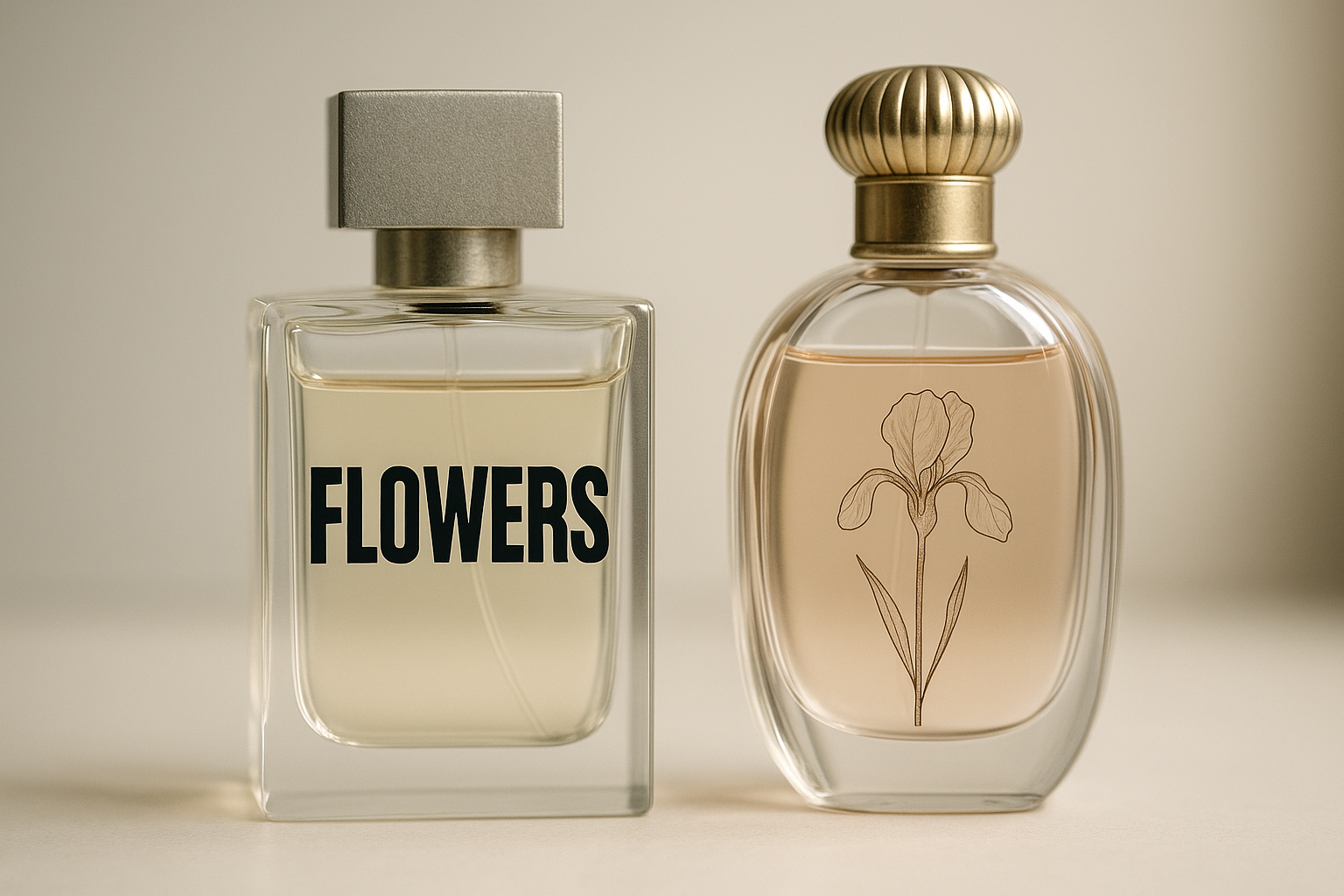
Typography must visually translate what the nose will soon experience. A rounded serif or a light calligraphic style would better mirror the softness and nostalgia such scents intend to evoke.
Imagine Chanel No. 5 with a blocky bold sans-serif—its timeless, whisper-like allure would be visually compromised. The font would overstate a fragrance that has always been about understatement.
2. When Rebranding Goes Too Bold
Heritage fragrances that rely on tradition, elegance, and legacy can suffer when bold fonts are forced into modernist rebrands.
Case in point: In 2023, a classic Italian perfumery attempted to reintroduce its oldest cologne line using a stark black-and-white design with condensed bold sans-serif fonts. Loyalists responded poorly, citing a loss of emotional warmth and a break from the product’s lineage. Despite improvements in shelf presence, online reviews noted that the scent “no longer felt like itself.”
This highlights an essential truth in luxury branding: bold fonts signal modernity and confidence, but not always heritage or romance. Rebranding must evolve gently, allowing typography to age gracefully with the scent.
3. When Typography Overpowers Other Design Elements
Packaging is a sum of parts: typography, bottle shape, materials, finish, and color. When the font carries too much visual weight—especially on smaller or delicate bottles—it can overwhelm the balance.
A minimalist perfume bottle with soft curves and pastel tones, when paired with intense typography, often sends mixed signals—like a whisper trapped in a megaphone.
Take, for example, some fast-fashion fragrance lines that mimic luxury with bold all-caps lettering on frosted glass. Without complementary visual cues like textured paper, foil stamping, or elegant bottle design, the bold font feels misplaced, even cheap. The result is a product that appears mass-produced rather than artisanal.
Design Insight
Bold typography, like a base note in perfumery, needs careful integration. It should anchor and enhance, not dominate. When used without sensitivity to context, it can flatten nuance, disrupt storytelling, and shift brand perception entirely.
The smartest brands test typography not just for impact, but for harmony—with the scent, the audience, and the visual narrative.
When Bold Typography Passes: How to Use It With Precision and Purpose
If there are clear scenarios where bold typography misfires, there are equally compelling cases where it elevates the packaging—bringing clarity, charisma, and brand cohesion. The key is not just in using bold fonts, but in how, where, and why they’re applied.
1. When Typography Echoes the Scent Profile
Bold fonts work best when they visually reinforce the character of the fragrance. A scent described as clean, modern, spicy, or urban deserves typography with strength and clarity. Sans-serif fonts like GT America Bold or Neue Montreal deliver crisp lines that match citrusy, aromatic, or leather-forward compositions.
Example:
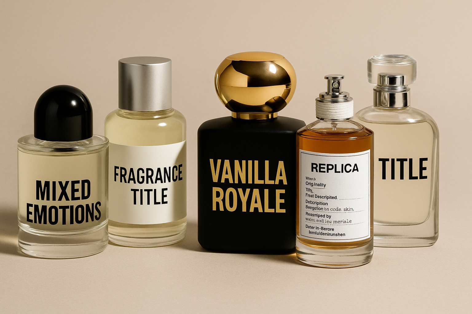
Byredo’s “Mixed Emotions” uses uppercase, spaced bold typography on a minimalist label. The type mirrors the abstract, unisex nature of the scent—structured but ambiguous, sharp but balanced.
2. When Packaging is Minimal by Design
Bold fonts shine brightest in minimalist layouts. When there’s no intricate graphics, florals, or gold framing, the font takes center stage. This “less is more” strategy works well when the typography is paired with high-quality materials—like frosted glass, textured paper, or matte finishes.
Example:
Le Labo has mastered this formula. Their industrial courier-style bold fonts are printed directly onto clinical-style labels with minimal embellishment. The design feels utilitarian and raw, which matches the brand’s apothecary-inspired positioning.
3. When the Target Audience Craves Impact
Bold typography performs well for Gen Z, younger millennial, and gender-neutral demographics who appreciate modernism and visual bluntness. These consumers are drawn to packaging that’s confident, statement-making, and Instagrammable.
Example:
Kayali Vanilla Royale used bold gold lettering against a matte black background. The font choice, while bold, was softened by pairing it with a symmetrical bottle and glossy finishes—making it feel luxurious rather than aggressive. The packaging was well-received across social platforms, largely because the boldness aligned with the fragrance’s sensual, intense profile.
4. When the Perfume Packaging and Typography Work as a System
Bold fonts work when they don’t fight for attention but instead fit seamlessly with the bottle silhouette, cap shape, and color palette. The synergy between bottle form and letterform is what creates shelf presence without discord.
Example:
Maison Margiela Replica fragrances balance bold condensed fonts with rectangular bottles, soft-tinted liquids, and clean label grids. The font doesn’t feel heavy—it feels structured. That’s the difference.
5. When Printing and Materials Elevate the Font
Execution matters as much as design. Bold fonts can look cheap if printed poorly, but when applied with finesse—via embossing, foil stamping, glass etching, or textured inks—they become tactile, memorable, and premium.
Brands that invest in these production choices often elevate bold fonts into a hallmark of luxury, rather than a visual shortcut.
Bold Typography in Perfume Packaging: Do’s & Don’ts
✅ Do | ❌ Don’t |
|---|---|
| Use bold fonts to reflect strong, modern, or unisex scents | Force bold type on soft, romantic, or floral fragrances |
| Pair bold typography with minimalist, clean packaging | Mix bold fonts with busy graphics or ornate visuals |
| Ensure legibility across digital + physical formats | Ignore how fonts perform in small-scale or mobile views |
| Elevate with embossing, foil, or textured finishes | Leave bold fonts flat and unsupported, making them look cheap |
| Localize fonts for cultural fit (e.g., Devanagari-inspired for Indian markets) | Apply one-size-fits-all Western fonts across all regions |
| Use bold strategically—brand name, key notes, or taglines | Make everything bold, which flattens hierarchy and overwhelms |
| Match font weight with bottle size and shape | Overpower delicate bottles with overly thick lettering |
| Prototype and test under real-world conditions | Assume bold will translate the same on every material |
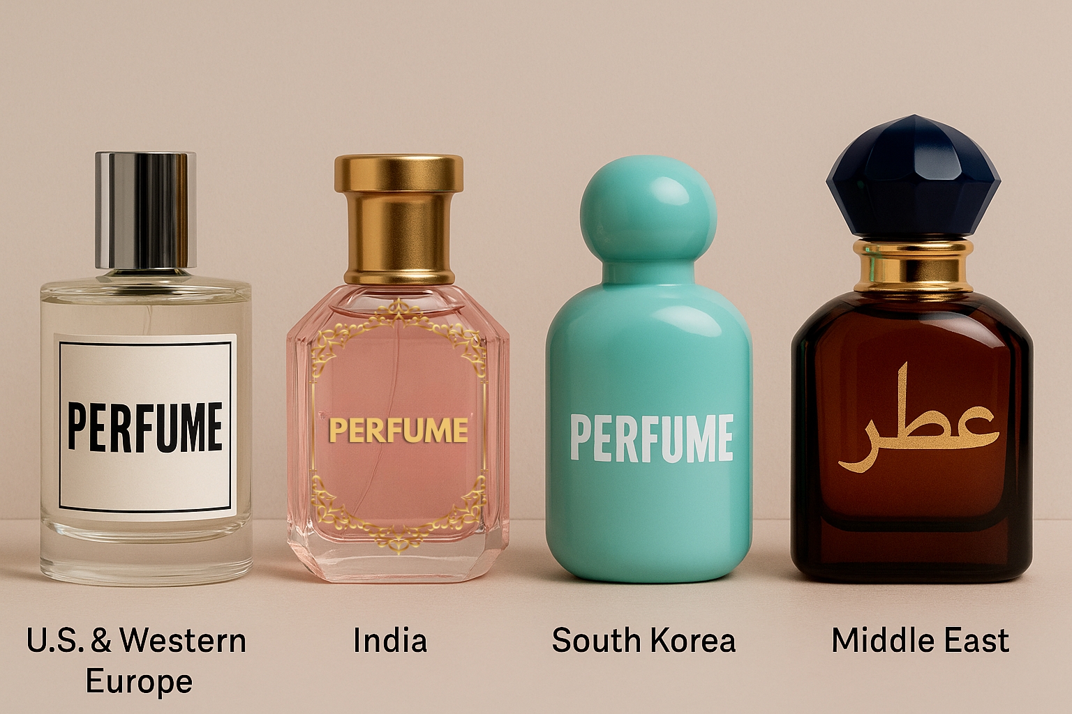
Typography Around the World:
Cultural Contexts and Contrasts
U.S. & Western Europe
Less is more: High-end brands favor subtle boldness (e.g., Maison Margiela’s label typeset).
Digital-native aesthetics dominate: Monospace, Helvetica, Neue Montreal.
India
Bold = Rich: Heavier fonts feel more luxurious in Tier 2/3 cities.
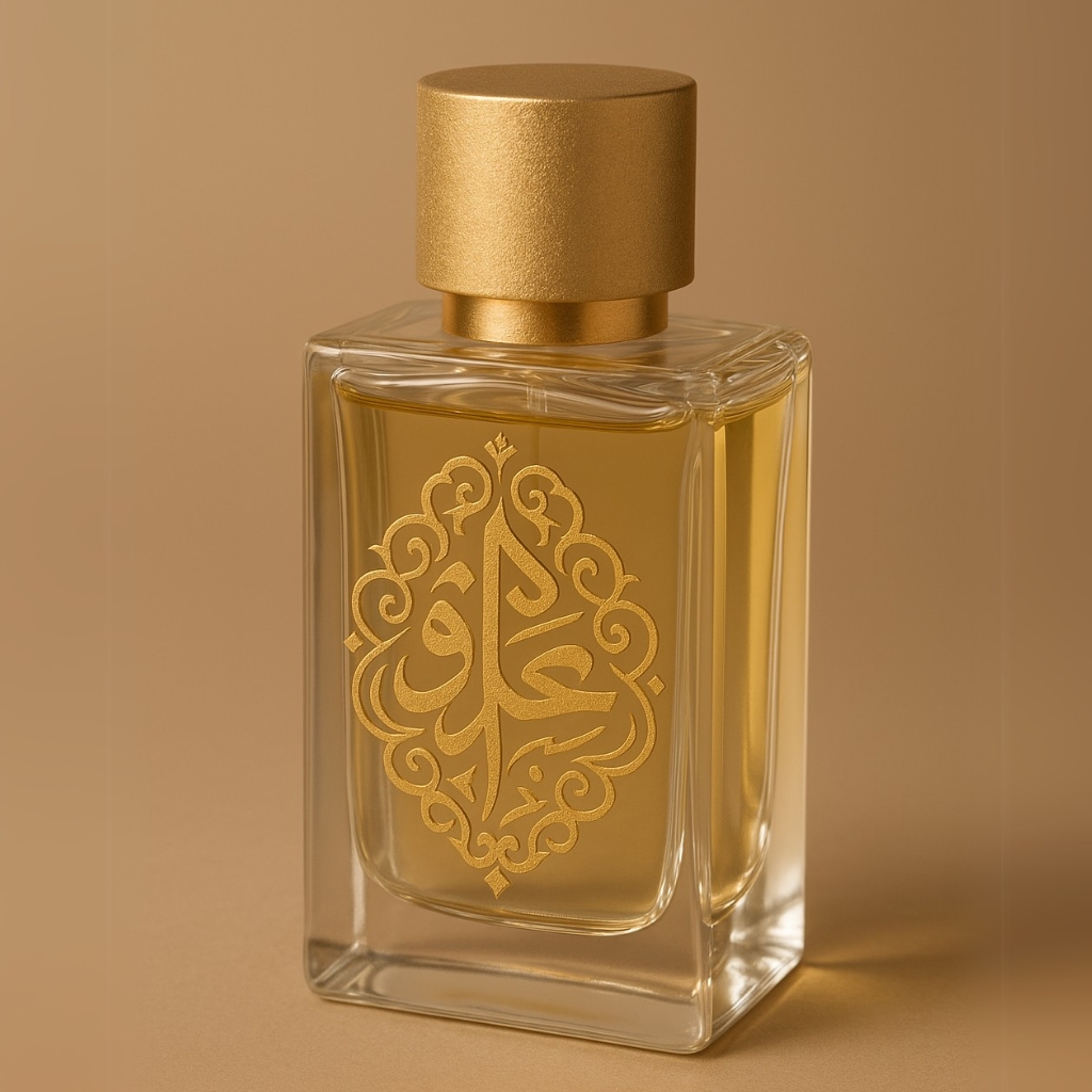
Script integration: Brands combine Devanagari or Urdu with bold Latin fonts for local pride.
South Korea
Quirky Bolds: Playful yet structured fonts (influenced by K-beauty).
Labels often combine pastel bottles with loud yet clean typography.
Middle East
Geometric and Kufic-styled bold fonts are increasingly popular.
Used on oud-heavy perfumes with jewel-toned glass, creating a bold-luxury hybrid.

| Scent Type | Ideal Font Style | Packaging Note |
|---|---|---|
| Aquatic | Wide, geometric bold | Transparent or metallic blue bottle |
| Floral | Soft serif or script | Avoid bold unless modern reinterpretation |
| Oriental | Sculpted bold serif | Deep-colored glass + gold foil |
| Gourmand | Rounded bold sans | Matte pastels or candy tones |
| Woody | Condensed uppercase bold | Earthy tones, textured paper or wood cap |
Sustainability Meets Typography: A Functional Partnership
Interestingly, bold fonts align well with the rise of sustainable design.
Reports from Clyde Presentation Packaging and Kospack (2024) show:
Minimalist bold typography reduces the need for decorative clutter, minimizing ink use.
Screen-printing or embossing bold type directly on glass bottles allows for label-free, recyclable designs.
A bold font, printed with intention, can be both luxurious and low-impact. It speaks to the new consumer who wants sustainability without compromising on visual command.
What’s Next: The Future of Bold Typography in Perfume Packaging
As 2025 unfolds, bold typography is no longer just a trend—it is evolving into a multi-sensory, digitally fluent, and culturally intelligent design tool. Typography in fragrance packaging is entering an era of responsive identity—where fonts not only reflect brand character but also adapt to context, culture, and technology in real time.
Below is a deeper look into how bold typography is poised to transform the perfume packaging landscape.
1. Custom Typeface Development:
Much like a perfume’s base note leaves a lasting impression, so does its typography. Forward-thinking brands are investing in custom-designed bold typefaces that function as intellectual property—visually distinct, legally protected, and emotionally resonant.
Example:
In 2024, Maison Crivelli launched a proprietary typeface with soft serifs and modular bold alternates. The typeface was designed to mirror the structure of its unconventional scent compositions—layered, dynamic, yet architectural.
According to Brand New’s Typography Trends Report 2024, over 43% of luxury beauty and fashion brands commissioned bespoke typefaces in the past year—up from just 18% in 2021.
Takeaway: Custom bold fonts are becoming as recognizable as logos. They offer visual exclusivity in a saturated marketplace and allow consistency across packaging, website, and campaign.
2. Tactile Typography:
In the high-touch world of perfumery, sensory packaging is gaining ground. Tactile typography is emerging as a powerful way to deepen emotional connection through touch. Bold fonts, with their natural visual weight, are ideal for physical enhancement techniques like:
Glass embossing (raised letterforms in frosted or clear bottles)
Velvet-coated typography (common in winter or oud-heavy editions)
Thermochromic or UV-reactive inks that change with temperature or light
Example:
Kayali’s Oudgasm collection (2024) used gold foil-embossed bold fonts with raised ink printing to signify warmth, intensity, and opulence. Consumers cited the texture as “a luxury experience before even smelling the product.”
Stat: According to Packaging Digest 2024, products with tactile elements see a 21% increase in shelf interaction time—a crucial metric in fragrance retail environments.
Takeaway: Bold fonts give brands a larger canvas for sensory enhancement—engaging touch as much as sight.
3. Smart Typography:
As packaging integrates more digital experiences—like QR codes, AR try-ons, and AI scent match tools—typography must now serve both human aesthetics and machine legibility. Bold fonts, particularly sans-serif variants with high x-heights and clean geometry, are ideal for:
Quick scan recognition in smart retail environments
Variable display resolution across digital and physical platforms
Dynamic adaptation to real-time personalization (e.g., names printed in bold at point-of-sale)
Example:
Huda Beauty’s fragrance arm, Kayali, began prototyping packaging in 2024 that adapts its label layout based on whether it’s being viewed in-store, online, or through an AR overlay. Fonts are adjusted in thickness, contrast, and tracking for each use-case.
Stat: A joint study by Adobe and MIT Media Lab (2024) found that AR-readable packaging with optimized typography increased interaction rates by 39% and brand memorability by 24%.
Takeaway: Typography must now be responsive—adapting not only to size and medium, but also to the technology that surrounds the product.

4. Culturally Adapted Typography:
Global fragrance brands are embracing culturally nuanced typography—where bold fonts draw from regional scripts, vernacular styles, and even heritage calligraphy to connect more deeply with local audiences.
Example:
Indian fragrance brand Fragranz India released a 2024 “Rasa Collection” featuring bold Devanagari-script-inspired type on matte amber bottles. The typography bridged the traditional with the contemporary—combining cultural identity with modern packaging trends.
Middle Eastern, Korean, and African luxury scent brands are also commissioning bold fonts that reflect local visual languages, including Kufic-inspired geometric scripts and Hangul-based modular fonts.
Stat: According to WGSN Packaging Futures 2024, brands that use culturally specific typography in regional markets see a 31% boost in local engagement.
Takeaway: Bold fonts don’t need to be globalized—when customized, they become tools for local storytelling.
5. Modular & Variable Fonts:
The rise of variable fonts—typefaces that can change weight, width, contrast, and optical size dynamically—is making typography more adaptive than ever. For fragrance brands, this means being able to use the same font across:
Mini sample bottles
Standard SKUs
Digital banners
Mobile packaging previews
Localized language adaptations
Example:
Maison Margiela Replica began testing variable bold fonts in 2024 to ensure perfect scale and readability across their full-size, travel-size, and body-care extensions.
Takeaway: Brands can now “stretch” a single bold font into multiple roles—maximizing visual consistency while adapting to format, region, and platform.
6. Eco-Optimized Typography:
As brands move away from layered, ink-heavy designs for sustainability, bold fonts offer a way to maintain shelf presence with fewer resources.
When printed in a single color, or etched directly onto glass, bold fonts deliver legibility, branding power, and style—without the environmental cost of multiple decorative treatments.
Example:
Aesop’s new fragrance line “Ecliptic” (2024) used a single-font layout—bold, center-aligned, all-caps—screen printed on a refillable bottle. The packaging had zero adhesives, zero labels, and was fully recyclable.
Stat: The Sustainable Packaging Coalition (2024) states that single-ink packaging with bold font design reduces production waste by up to 37% compared to multi-layered, label-heavy alternatives.
Takeaway: Bold typography allows for dramatic impact in packaging that’s light on materials but rich in meaning.
Making Bold Typography Work: Practical Tips
For bold typography to shine, execution matters.
Use neutral backgrounds and structured bottle forms to let the font speak without interference.
Pair heavy font weights with premium finishes like embossing or hot stamping.
Match font mood with scent profile: never use a cold industrial bold for a romantic floral.
Don’t ignore the packaging surface—bottle shape and material will alter font perception.
Always prototype across physical and digital channels. A font that looks luxurious in hand may appear aggressive online.
How Ajanta Bottle Can Help You Nail Bold Typography in Perfume Packaging
Bold typography may start on a designer’s screen, but it reaches its true impact only when printed flawlessly on a stunning bottle. That’s where Ajanta Bottle, a trusted name in premium glass packaging for over 43 years, becomes your most valuable partner. With more than four decades of expertise in the packaging industry, Ajanta Bottle brings unmatched technical know-how and a deep understanding of what works in the fragrance market—both aesthetically and commercially. We’ve seen trends come and go, and we know how to make bold typography stand the test of time.
Typography doesn’t work in isolation—it needs the right canvas. Ajanta Bottle offers:
A curated portfolio of premium perfume glass bottles in various shapes and finishes.
Compatibility with frosted, clear, and colored glass to support diverse typography styles.
Our bottles are designed to complement both modern, bold labels and heritage-rich type-driven designs.
Connect with us:
- Email at sales@ajantabottle.com
- Phone/Whatsapp: +91 9891098918
You can also shop from more than 500+ packaging solutions on www.ajantabottle.com – India’s first ever comprehensive packaging e-commerce portal.
For additional information, browse through our blog at https://www.ajantabottle.com/public/blog/ or subscribe to our latest updates through our social media channels,
*YouTube channel: https://www.youtube.com/c/Ajantabottle
*LinkedIn Page: https://www.linkedin.com/company/ajantabottle
*Facebook Page: https://www.facebook.com/glassbottleindia
*Instagram Page: https://www.instagram.com/ajantabottle/
*Google Business Profile Manager: https://g.page/r/CXTH9MKpe2DuEBM/review


