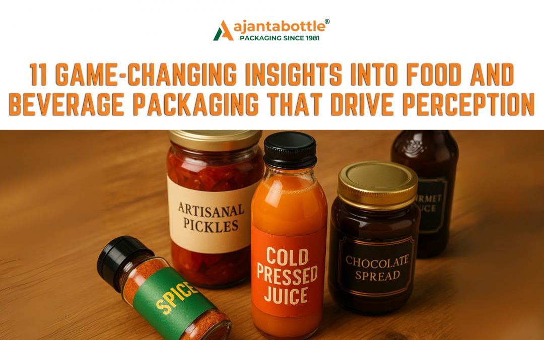
In the competitive world of the food and beverage industry, where shelves overflow with options and digital storefronts compress choice into thumbnails, packaging is no longer a secondary concern. It is a primary driver of consumer perception. Before flavor, price, or provenance can play their part, it is the packaging that shapes the customer’s belief about a product’s quality, value, and trustworthiness.
In fact, for many food and beverage service operators, whether boutique restaurateurs or global delivery brands, packaging has become a critical part of the end-user experience. It bridges brand narrative, consumer expectations, and functional performance. And increasingly, it determines not just whether a product gets picked but whether it gets remembered and repurchased.
Let’s delve into 11 critical insights that explain how packaging influences perceived quality in the food and beverage domain and why it matters more today than ever before.
First Impressions in the Food and Beverage Industry: Designed to Be Judged
Walk into any supermarket or scroll through an online grocery app, and you will notice one simple truth. Shoppers are not just buying food and beverages for nourishment or refreshment. They are buying into stories, expectations, and perceptions, all of which are shaped within the first few seconds by how the product is packaged.
In the food and beverage industry, first impressions carry weight. A 2022 study by Ipsos revealed that nearly 72 percent of consumers admit packaging design influences their purchasing decision. This influence occurs within a matter of seconds, often before the customer reads a single word or even checks the ingredients. When a consumer picks up a glass jar of jam or a bottle of cold-pressed juice, the decision to trust, try, or buy is already well on its way before the cap is even opened.
This becomes even more critical in a country like India where over 80 percent of retail is still unorganised and highly visual. Products are competing in cluttered kirana shops, on crowded delivery apps, or behind restaurant counters. In such scenarios, packaging is not merely a finishing touch. It is the first salesperson, silently communicating the brand’s values, the product’s quality, and the overall promise of safety and hygiene.
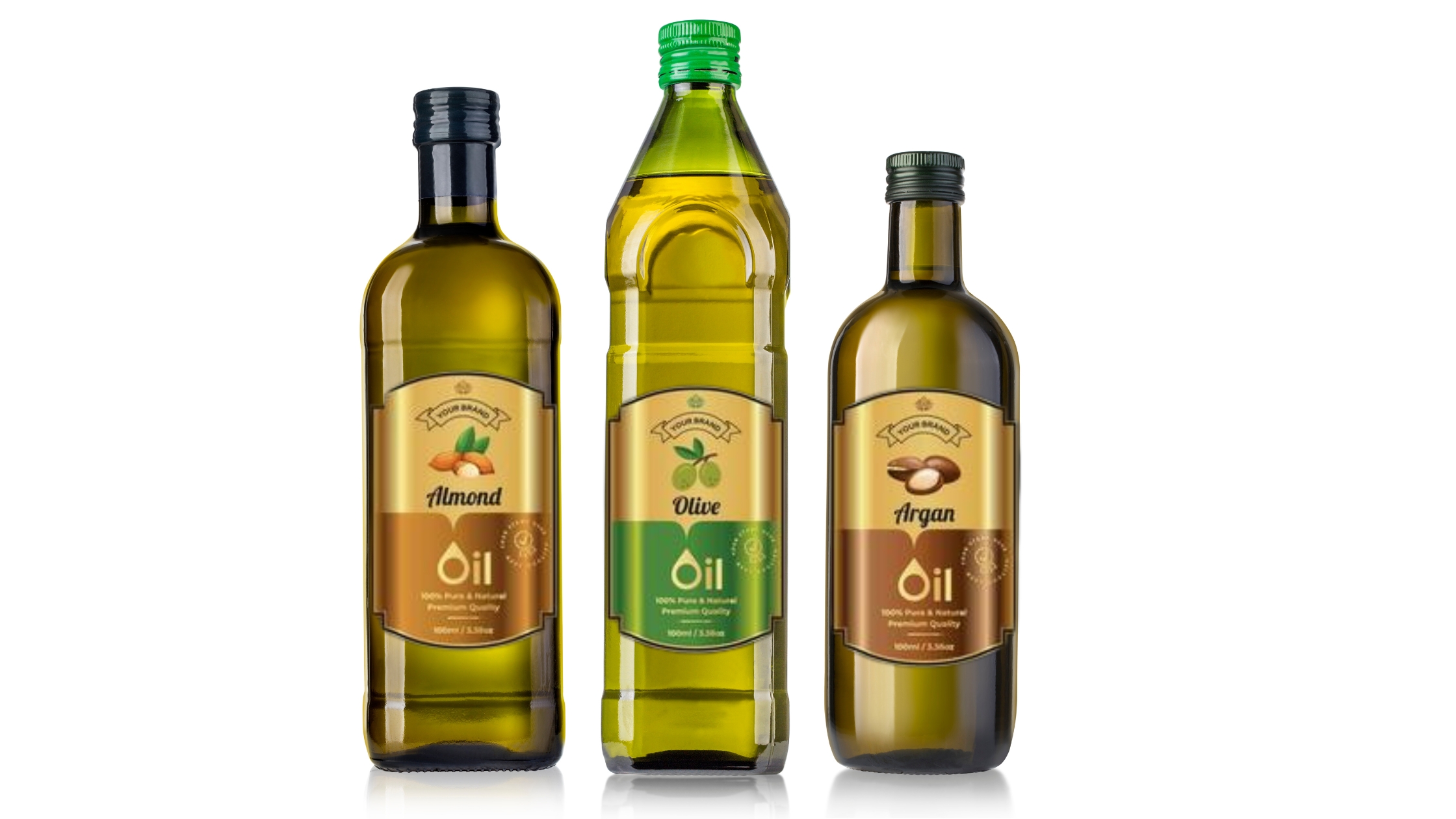
Take a simple example from the growing segment of spice mixes. Brands that use vibrant glass jars with clean typography and clear tamper-evident seals are perceived as more trustworthy and authentic. These brands often see a 30 percent higher shelf pickup rate compared to similar blends in generic plastic packets, as reported in a packaging industry survey conducted by Deloitte in 2023. Why? Because the packaging creates a perception of care and quality that aligns with the emotional expectations of Indian households.
The same holds true across other product segments:
-
A clean, matte-finish label on an artisanal pickle jar implies handcrafted quality and shelf elegance.
-
A glossy wrap with bold colors on a ready-to-drink coffee bottle evokes energy, convenience, and a modern lifestyle.
-
Embossed glass or foil-stamped labels on gourmet sauces or luxury chocolates communicate indulgence, care, and high value.
These impressions are often formed subconsciously. Consumers interpret color schemes, material finishes, and structural design emotionally before they rationalize what they are seeing. In this sense, packaging is more than just branding; it becomes a psychological shortcut to perceived product quality.
Competitive Insight
As private label brands and digital-first startups enter every aisle from condiments to kombuchas, packaging has become the last remaining physical differentiator. In a world of algorithmic product listings and generic store layouts, it is packaging that draws the eye and anchors the memory. For challenger brands entering the food and beverage industry, a strong packaging strategy can help establish credibility and command shelf presence even against legacy giants.
Strategic Design: Where Form Meets Competitive Advantage
In the food and beverage industry, packaging design is not just about aesthetics. It directly influences consumer trust, buying decisions, shelf standout, and price perception. A thoughtfully designed product can command attention, justify a premium, and build a lasting brand memory.
According to McKinsey & Company’s 2023 report, Packaging: The underrated performance and value driver, businesses that take a strategic approach to packaging often achieve measurable improvements across the value chain.

What Strategic Design Communicates (Without Saying a Word)
| Design Element | Message Conveyed | Best For |
|---|---|---|
| Clean minimalist design | Purity, transparency, modern health consciousness | Wellness drinks, organic teas, low-sugar snacks |
| Earth-toned labels & textures | Sustainability, eco-awareness | Vegan spreads, plant-based beverages |
| Embossed glass or foil labels | Craftsmanship, luxury, exclusivity | Gourmet sauces, premium oils, fine chocolates |
| Bold traditional colors | Heritage, culture, trust | Pickles, spice blends, ethnic snack packs |
| Matte finish or soft touch | Premium feel, innovation, professional care | Cold brews, nut butters, export-grade condiments |
Case Examples: Strategic Design Across Product Types
-
Cold-Pressed Juices
-
Strategic Design Move: Transparent bottles with soft pastel labels
-
Why it Works: Visual proof of freshness and simplicity
-
Outcome: Higher repeat purchases in the wellness category
-
-
Heritage Pickle Brands
-
Strategic Design Move: Wide-mouthed glass jars, handwritten fonts, jute-top covers
-
Why it Works: Evokes nostalgia and cultural authenticity
-
Outcome: Boost in export viability and gift-market appeal
-
-
Luxury Chocolate Spreads
-
Strategic Design Move: Embossed jars, gold-foil accents, rigid boxes
-
Why it Works: Aligns product perception with premium pricing
-
Outcome: Strong positioning in gourmet and gifting segments
-
Common Design Mistakes That Undermine Brand Value
-
Cluttered Label Design
Overloading packaging with too much text or imagery reduces visual clarity and brand focus. -
Poor Print or Material Quality
Low-grade printing and flimsy packaging can make even the best product appear unreliable. -
Neglecting Sensory Design
Ignoring tactile elements like grip texture, cap functionality, or surface finish diminishes the user experience. -
Ignoring Logistics Compatibility
Packaging that is difficult to stack, barcode, or ship often results in lower retailer acceptance and higher breakage risk.
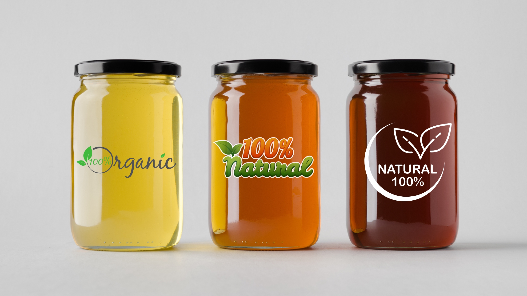
Color Psychology: Appetite and Trust Begin Visually
Color is one of the most immediate and influential design tools in the food and beverage industry. It is the first thing consumers notice and often the last thing they remember. Far beyond decoration, color works as a subconscious signal that shapes emotion, drives expectations, and ultimately influences behavior. In fact, a study by the Institute for Color Research found that people make a subconscious judgment about a product within 90 seconds of initial viewing, and up to 90 percent of that judgment is based on color alone.
This makes color not just an aesthetic decision, but a commercial one. When chosen and applied with intention, color in packaging becomes a psychological shortcut to brand positioning and product value. It can attract attention, communicate freshness, suggest taste profiles, and evoke trust.
Let us explore the emotional and commercial significance of common colors in food and beverage packaging:
| Color | Emotional Cue | Application in Food and Beverage Packaging |
|---|---|---|
| Red | Stimulates appetite, urgency, excitement | Used in sauces, spicy snacks, fast food, and energy drinks |
| Green | Freshness, health, sustainability | Dominates packaging for vegan, organic, and cold-pressed products |
| Blue | Purity, hydration, reliability | Often seen in water bottles, milk cartons, and electrolyte drinks |
| Black | Sophistication, indulgence, exclusivity | Used for luxury chocolates, wine, gourmet oils, and niche condiments |
| Yellow | Happiness, warmth, youthfulness | Associated with fruit juices, children’s snacks, and cheerful branding |
| Orange | Energy, fun, affordability | Effective in carbonated drinks, comfort foods, and street snacks |
| White | Cleanliness, simplicity, peace | Found in dairy, minimalist brands, and health supplements |
| Brown | Authenticity, earthiness, handcrafted feel | Common in nut butters, granola, whole grains, and artisanal packaging |
The Cultural Relevance of Color in Indian Packaging
In India, color carries deep emotional and symbolic meaning. It is not just about visual appeal but about invoking memory, ritual, and tradition. For example:
-
Saffron and turmeric yellow are widely used in spice blends and Ayurvedic food packaging because they evoke warmth, purity, and sacredness. These colors tap into cultural memories of home-cooked meals and festive thalis.
-
Bright reds and maroons in traditional Indian sweets packaging suggest celebration, passion, and prosperity. Consumers often associate these tones with festivals, weddings, and joyous occasions.
-
Deep greens and peacock blues, found in leafy designs or nature-based brands, align with India’s growing focus on wellness, herbal ingredients, and sustainability.
Successful Indian food and beverage brands, especially in the spice, dairy, and snack segments, use these cultural codes to connect with consumers at an emotional level. Packaging for brands like MDH, Paper Boat, or Amul leverage traditional color palettes not just for differentiation but for cultural resonance and familiarity.

Why Color Choice Should Align with Product and Positioning
It is crucial that the color scheme matches the product offering and brand promise. For example:
-
A cold-pressed olive oil packaged with neon typography or fluorescent color tones may confuse or repel premium health-conscious buyers.
-
A luxury chocolate in a sky-blue or pastel wrapper may fail to evoke the indulgence and richness typically associated with the category.
-
A snack for children wrapped in pale or monotone colors may not stand out next to competing brands that use vibrant, playful palettes.
The disconnect between color and product message creates cognitive dissonance for consumers. This leads to poor product pickup rates, even if the quality inside the package is high.
Business Insight
Brands in the food and beverage sector that conduct proper color testing during packaging development can significantly improve shelf conversion rates. Packaging design firm Pantone reports that brands who align color with consumer emotion and product category see a measurable uplift in engagement and trust, sometimes by as much as 25 percent.
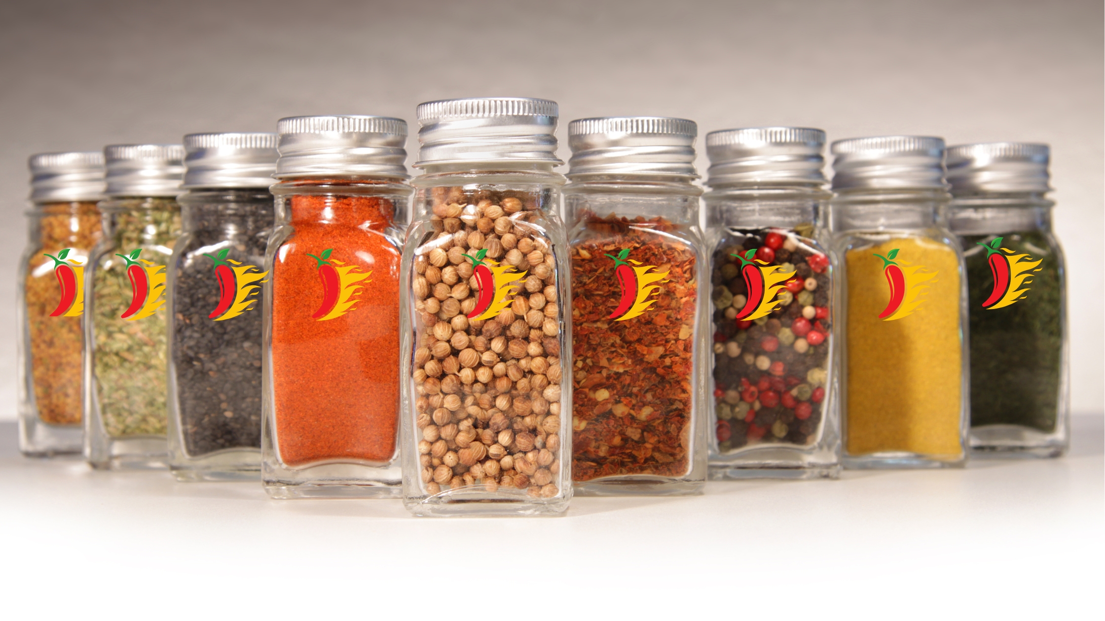
Fonts and Labels: Communicating Without Words
In the food and beverage industry, packaging is your frontline communicator. Beyond color, shape, and material, typography and labelling carry an enormous amount of silent yet persuasive influence. The right font can evoke feelings of tradition, innovation, or trust, while the wrong one can quickly undermine the professionalism and positioning of a brand. Labels, too, are not just functional information carriers. They are storytelling surfaces that help consumers understand, trust, and remember a product.
Typography is not about decoration. It is about perception. Whether a brand wants to appear modern, premium, playful, organic, or rooted in legacy, the font becomes the visual embodiment of that brand voice. For instance, consider a high-protein energy drink targeted at athletes. A strong, bold, sans-serif font conveys power and clarity, helping the product appear functional and reliable. Now contrast that with a handcrafted herbal tea blend. A serif font or handwritten script instantly makes it feel calming, authentic, and natural.
Here are some font styles and the impressions they typically create in food and beverage packaging:
| Font Style | Emotional Association | Common Use Cases |
|---|---|---|
| Bold Sans-Serif | Strength, confidence, clarity | Energy drinks, protein powders, plant-based supplements |
| Serif Fonts | Heritage, trust, professionalism | Legacy food brands, aged teas, export-grade condiments |
| Cursive / Script | Craftsmanship, nostalgia, warmth | Homemade pickles, artisanal chocolate, traditional spice blends |
| Rounded Fonts | Friendliness, youthfulness, simplicity | Beverages for children, flavored milk, fruit snacks |
| Minimalist Typeface | Purity, health, transparency | Cold-pressed juices, gluten-free baked goods, sustainable packaging |
The Importance of Clarity in Food and Beverage Service Packaging
In the food and beverage service space, where many purchases happen through takeaway, cloud kitchens, or quick-service outlets, the importance of typography goes beyond aesthetics. It becomes a tool of navigation. When packaging is viewed at arm’s length, in low lighting, or during transit, consumers must be able to clearly read the product name, expiry date, ingredients, usage instructions, and branding.
A 2022 report by the International Food Information Council (IFIC) emphasized that over 70 percent of consumers rely on product labels to evaluate safety and nutritional value. If a label is hard to read, cluttered, or misaligned, the product may be seen as unreliable, even if the contents are high quality.
Legibility is particularly crucial in regulatory environments. Government guidelines often require minimum font sizes, contrast ratios, and placement for allergens, manufacturing details, or nutritional tables. Non-compliance can result in legal issues and product recalls. This is especially relevant for exporters in the food and beverage industry, where each country has distinct packaging and labelling laws.
Label Hierarchy and Information Architecture
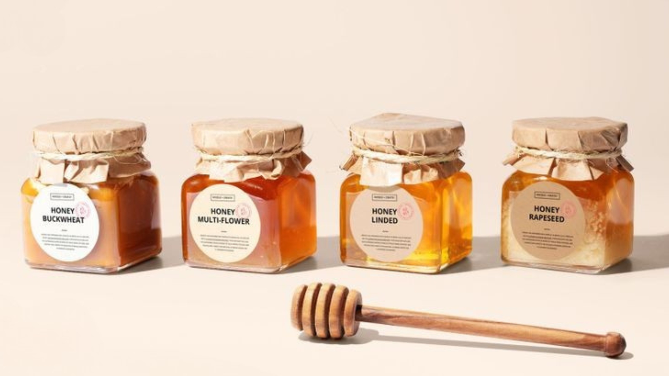
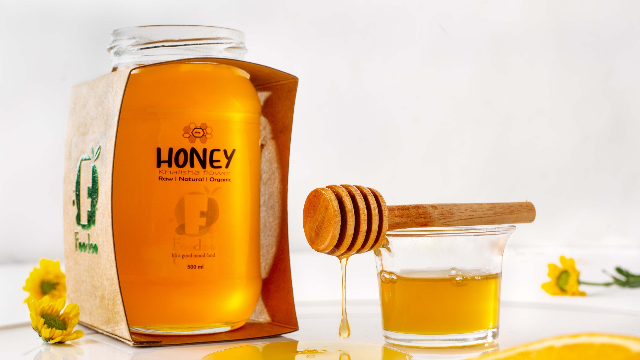
The order in which information appears on your label matters. This concept, often referred to as label hierarchy, determines what a consumer sees first, what they understand next, and what stays with them. A well-structured label will have a dominant element such as the product name or brand mark at the top or center, followed by a short descriptor (for example, “100% natural Himalayan honey”), and then regulatory information toward the base or back.
Poor label hierarchy confuses the buyer. If a consumer has to work hard to find the product name, understand what it is, or figure out if it suits their dietary needs, they are more likely to move on to another option. In retail shelves and especially in online marketplaces, this can result in immediate drop-off.
Finish, Texture, and Printing: The Subconscious Signals
Beyond fonts, the material quality of the label also plays a role in brand perception. A matte label often suggests sophistication and calmness. A high-gloss finish implies vibrancy or indulgence. Textured or embossed labels create a tactile experience that adds a layer of authenticity and care. When a consumer picks up a bottle and feels a linen-textured label or a raised brand name, they perceive the product as more valuable.

Research from Avery Dennison shows that products with textured or multi-sensory labels experience an average 18 percent increase in repeat purchase behavior. This is because touch reinforces memory. When you combine a visually appealing label with a physically engaging surface, the consumer becomes more emotionally connected to the product.
Mistakes to Avoid in Typography and Labelling
-
Overcrowding: Trying to include every detail on the front label can make your packaging look unprofessional. Use both front and back labels strategically to divide information.
-
Low contrast: Light grey text on a white label may appear sleek in mockups but is unreadable under supermarket lighting.
-
Inconsistent typefaces: Using multiple fonts in different sizes and weights without a clear hierarchy can make the product feel chaotic or indecisive.
-
Mismatched branding: A playful, informal font on a product that claims to be premium or science-backed creates confusion and breaks trust.
-
Poor alignment or print registration: Labels that are skewed, faded, or wrapped incorrectly suggest quality control issues and can reduce consumer confidence.
Consistency Equals Credibility
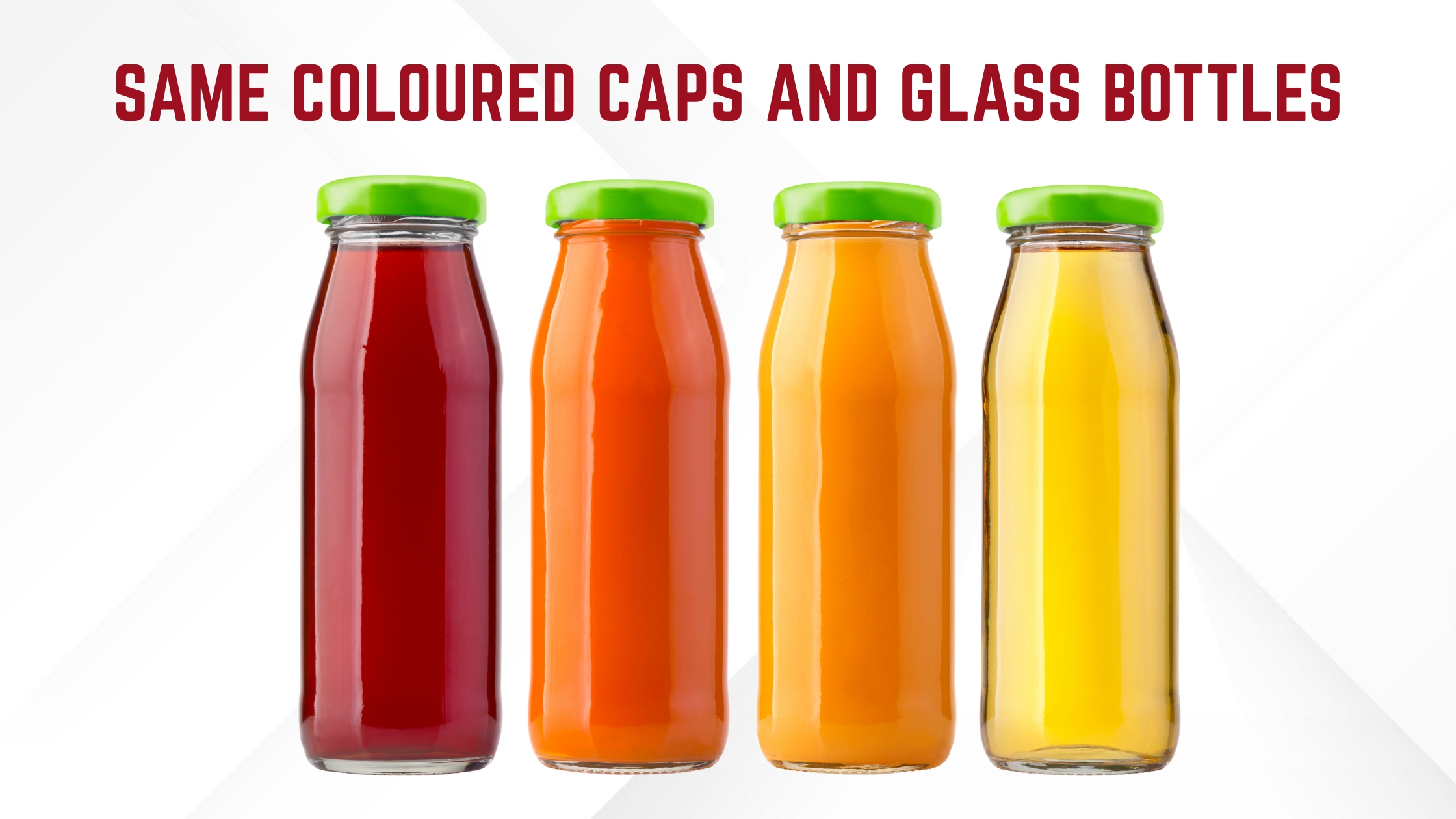
In the food and beverage industry, where product options are overwhelming and consumer trust is hard-earned, packaging consistency plays a critical role in building long-term brand credibility. From global corporations to emerging regional players, visual and structural consistency is one of the most effective ways to ensure that a product is both recognized and remembered.
Consistency in packaging is not simply about repetition. It is about creating a cohesive and reliable brand language that helps consumers form lasting mental associations. A brand that maintains a recognizable identity across multiple touchpoints earns subconscious trust. When a customer sees familiar elements such as a signature color, a specific cap design, or a label texture repeated across different SKUs, they experience reassurance. This continuity reinforces the perception that the brand is organized, reliable, and professional.
Psychological Insight: How Consistency Builds Consumer Confidence
Brand psychology studies have shown that consistent visual identity increases consumer trust and recall. According to research published by Lucidpress, maintaining brand consistency across platforms can increase revenue by up to 23 percent. The reason is simple. Humans are pattern-seeking beings. When we encounter repeatable, familiar design systems, our brains process the experience as safe and trustworthy.
In the context of the food and beverage industry, where hygiene and quality are paramount, inconsistent packaging elements can create friction or doubt. For example, if a consumer encounters a coconut water brand with a clean, green label in one store and a bright orange version in another, they may hesitate to buy. They might wonder if one is fake, expired, or part of a different product line. That moment of confusion can cause a lost sale, even if the product inside is identical.
Real Brand Examples
-
Coca-Cola is perhaps the most iconic example of visual consistency. The red background, white script, and contour glass bottle have barely changed in over a century. Even when launching special editions or limited flavors, the core design elements remain untouched. This consistency helps Coca-Cola maintain an instant visual presence across over 200 countries.
-
Amul, a legacy brand in India’s food and beverage industry, has successfully preserved the appearance of its butter packs and mascot since the 1960s. The Amul girl appears on nearly every campaign, and the brand’s blue and yellow color palette is used consistently across products such as milk, cheese, cream, and ice creams. This visual continuity has made Amul one of the most trusted food brands in the Indian market.
-
Frooti, originally a mango drink in tetra packs, transitioned to PET bottles while retaining its bright yellow branding and geometric fonts. Despite evolving its packaging structure and adapting for retail trends, the brand never lost its core visual elements, allowing it to stay relevant while remaining familiar to older and newer consumers alike.
Key Areas Where Consistency Must Be Maintained
-
Color Palette
-
Use the same core colors across all SKUs to build instant brand recognition.
-
Avoid dramatic color shifts for similar products unless clearly launching a new category.
-
-
Typography and Logo Placement
-
Position your brand name, logo, and key descriptors in the same location on every label or box.
-
Ensure fonts, spacing, and alignment are standardized across your product family.
-
-
Material and Finish
-
A glossy label on one variant and a matte label on another might confuse buyers.
-
Material consistency, especially in premium products like oils, teas, or beverages, is essential for retaining luxury positioning.
-
-
Structural Packaging Design
-
Keep bottle shapes, cap types, and jar widths uniform unless a functional change is absolutely necessary.
-
Delivery-ready items should use packaging that mirrors the retail versions, even when adapted for transport.
-
-
Brand Voice and Messaging
-
The tone of your product descriptions, taglines, and claims must remain consistent across regions and platforms.
-
For example, if you speak about tradition and purity on one SKU, avoid switching to bold, techy language on another unless launching an entirely new vertical.
-
Seasonal and Limited-Edition Packaging: Flexibility within Familiarity
While consistency is essential, it does not mean design should be static or boring. Brands can still create seasonal, festive, or special-edition packaging, but it must be done within a clear and recognizable framework. This means retaining brand colors, typefaces, and layout hierarchy while adding culturally relevant motifs or accents.
For example, a ghee brand can add subtle Diwali elements like diya icons or gold borders to its jar labels without altering its primary layout or brand signature. Similarly, beverage companies can introduce limited winter flavors in the same bottle shape and cap color while adding a sleeve with snowflake patterns or warm-toned labels. This balance allows a brand to remain fresh and engaging without compromising recognition.
Business Impact of Packaging Consistency
| Metric | Impact of Packaging Consistency |
|---|---|
| Brand Recall | Increases by 80 percent when consistent packaging is used across SKUs |
| Purchase Intent | Grows by 33 percent when consumers instantly recognize a product on shelves |
| Operational Efficiency | Improved when label templates, bottles, and caps follow a unified standard |
| Retail Shelf Preference | Consistent lines receive better shelf-blocking and visual placement |
| Consumer Trust and Loyalty | Strengthened due to familiarity and perceived reliability |
(Source: Lucidpress Brand Consistency Report 2022, Packaging World Retail Survey)
Packaging Shapes That Speak Without Words
In the food and beverage industry, structural packaging design is often undervalued compared to visual elements like color or labels. Yet shape is one of the most immediate cues that signals quality, innovation, and brand identity to the consumer. It is a powerful communicator that appeals to both function and emotion. When strategically developed, packaging structure becomes a silent differentiator on crowded retail shelves and in digital thumbnails.
Consumers subconsciously associate unique or well-engineered packaging shapes with higher value. A honey jar in a hexagonal glass container does more than mimic the geometry of honeycombs. It visually reinforces natural sourcing and purity. A square water bottle may feel modern and premium. A curved glass bottle for cold brew suggests craftsmanship and freshness. These design decisions are not purely aesthetic. They influence tactile experience, brand perception, and even user satisfaction.
How Structure Influences Perception in the Food and Beverage Sector
Structural packaging shapes do more than attract attention. They anchor meaning. In the food and beverage industry, where consumers interact physically with products every day, packaging shapes directly impact brand memory and perceived quality.
Here are examples of how shape reinforces positioning:
| Packaging Shape | Perceived Message | Common Applications |
|---|---|---|
| Hexagonal or Octagonal | Nature-inspired, premium, artisanal | Honey jars, Ayurvedic supplements, spice blends |
| Tall cylindrical bottle | Sleek, functional, modern | Cold brews, infused waters, protein drinks |
| Wide-mouthed jars | Generosity, ease of use, homeliness | Ghee, nut butters, chutneys |
| Tetra packs or slim packs | Portability, on-the-go lifestyle | Juice boxes, flavored milk, smoothie packs |
| Embossed glass bottles | Heritage, legacy, tactile engagement | Table sauces, fine oils, premium mineral water |

The Functional Role of Structure in Food and Beverage Service
In food and beverage service formats like takeaway, delivery, or institutional catering, structure takes on an even more critical role. A container that prevents spills, allows easy stacking, or resists heat damage contributes directly to consumer satisfaction. A bottle that does not leak during transport or a jar that opens with ease builds confidence and repeat purchases.
For instance, many cloud kitchens now prefer PET or glass jars with wide mouths and airtight lids for delivering pickles, dips, or desserts. This is because such containers preserve aroma, ensure hygiene, and offer customers the opportunity to reuse the packaging, which adds perceived value.
Another example is resealable pouches used for snacks and trail mixes. These allow consumers to consume in portions without worrying about spoilage. Resealability, though structural in nature, is often seen as a mark of thoughtfulness and product care.
Sensory Feedback and Shape: Building Emotional Connection
The structure of packaging also contributes to multisensory brand recall. Consumers remember not just how a package looks, but how it feels in their hands and how it opens or closes. For instance, a glass bottle with embossed lettering provides a textured grip that adds elegance and weight to the experience. A tamper-evident cap offers an audible click, reinforcing freshness and security.
According to a 2023 study by the Journal of Packaging Technology and Research, sensory interaction with packaging, such as texture, ergonomic design, and structural sound, enhances product memorability by over 30 percent. In the food and beverage industry, where shelf competition is intense and products often feel similar in content, it is the packaging experience that helps brands remain top of mind.
Sustainability and Structure: When Shape Supports Responsibility
Structural design can also support sustainability goals. Brands are increasingly shifting to stackable glass jars, square bottles, or collapsible pouches to optimize shipping and reduce carbon footprint. Compact packaging that reduces air gaps during transportation allows companies to ship more units per truckload, directly lowering fuel consumption and logistics costs.
Some beverage brands are moving away from traditional round bottles to square ones, not just to appear modern but to improve space efficiency. The structural change is minor to the eye but significant in terms of transport, warehousing, and environmental performance.
Examples from the Market
-
S.Pellegrino uses a uniquely curved green glass bottle with embossed star detailing, establishing a premium and timeless presence on any restaurant table.
-
Paper Boat originally launched with a soft pouch that created nostalgia and playfulness. Later, it added structured matte-finish bottles for modern retail visibility and export readiness.
-
FIJI Water distinguishes itself with a square bottle that looks luxurious and stacks well on shelves, enhancing both retail presence and shipping efficiency.
-
Raw Pressery, an Indian cold-pressed juice brand, leverages transparent cylindrical bottles with a wide neck that support visibility and ease of drinking, especially for health-conscious buyers.
Packaging That Performs in Delivery: A Pillar of Food and Beverage Service
In today’s fast-evolving food and beverage service landscape, the role of packaging has expanded far beyond product containment. With the rise of cloud kitchens, online-only restaurants, doorstep grocery platforms, and meal subscription models, packaging is no longer simply a delivery tool. It is now a crucial brand experience medium. In fact, for many food and beverage consumers, the packaging is the very first physical point of contact they have with a brand.
Unlike traditional retail, where packaging is judged at the shelf, delivery packaging is evaluated in real-time use. A leaking curry container, a crushed dessert box, or a poorly sealed juice bottle can undo weeks of branding work and kill the chance of repeat orders. On the other hand, when packaging delivers both protection and presentation, it builds brand credibility, fosters emotional connection, and earns loyalty.
Why Packaging Must Perform Beyond Transit
In the food and beverage service segment, delivery packaging must excel in five key performance areas:
-
Structural Integrity
-
Packaging must withstand the challenges of stacking, movement, and thermal fluctuations during transportation.
-
Materials like rigid glass jars with secure twist caps or PET bottles with induction seals help avoid spills and maintain shelf stability even during bumpy last-mile transit.
-
-
Temperature Retention
-
Retaining food temperature is critical to ensuring quality upon arrival.
-
Heat-insulated foil wraps, double-walled containers, or temperature-control sleeves preserve warmth in meals and freshness in cold beverages.
-
Brands in the soup, biryani, and ready-to-eat beverage categories benefit significantly from this functionality.
-
-
Airtight and Leak-Proof Sealing
-
For liquids, gravies, or sauces, even the tiniest leakage can ruin the overall customer experience.
-
Leak-proof jars, liners, and double-seal caps ensure product integrity and reduce in-transit damage.
-
-
Portioning and Stackability
-
Standardized container shapes and portion sizes improve logistics, reduce packaging waste, and make it easier for staff to assemble orders quickly.
-
Stackable containers enhance warehouse efficiency and reduce breakage during bulk movement.
-
-
Customer Usability and Reusability
-
Easy-open lids, ergonomic shapes, and minimal mess enhance the unboxing experience.
-
When customers find the packaging useful or aesthetically pleasing, they are more likely to retain and reuse it.
-
From Functional to Marketing Asset: The Power of Branded Delivery Packaging
Branded delivery packaging is not just protective. It is promotive. Each box, jar, or bottle that arrives at a customer’s doorstep is a branding opportunity. Think of it as a mobile billboard that enters homes, gets placed on dining tables, and even becomes part of social media posts.
Reusable glass jars with embossed logos or food-safe paper pouches with signature typography help consumers remember the brand long after the meal is finished. In homes, these containers often find a second life storing spices, teas, or leftovers. Every reuse extends the brand narrative and increases cost-efficiency per impression.
Moreover, clean, well-labeled packaging reassures consumers that the brand values safety and transparency. Inclusion of allergen declarations, sourcing details, heating instructions, or QR codes that link to sustainability practices elevate the experience and build trust.
Food and Beverage Industry Examples
-
FreshMenu, a cloud-kitchen based model, uses tamper-evident seals and structured compartments to keep meals neatly organized and spill-free during delivery.
-
Sleepy Owl Coffee delivers cold brews in tall glass bottles with black caps and printed graphics. These bottles have become iconic and are often reused in households, making the brand visible every day.
-
Chaayos leverages double-layered, branded cups with spill-proof sipper lids for delivering hot chai, ensuring safety and warmth without sacrificing convenience.
Retail Shelf Realities: Competing with Visual Intelligence
In the physical retail environment, packaging design is no longer just a branding element. It functions as your most hardworking salesperson. Unlike e-commerce platforms where filters, reviews, and descriptions guide choices, retail buying decisions often happen in just a few seconds. In those moments, the packaging must communicate quality, trust, category relevance, and product value without requiring a single word to be spoken.
This is particularly important in the food and beverage industry, where the product is rarely opened before purchase. In most cases, consumers do not get to taste the juice, inspect the ghee, or smell the spice blend before they decide to buy. Their decision is entirely based on how the packaging looks, how it feels in the hand, and whether it visually fits the image of what they associate with high-quality food or beverage products.
Why Packaging Is a Silent Salesperson in Retail
Studies show that 68 percent of retail shoppers decide on a product at the shelf. This means your product packaging must attract attention, provide clarity, and build confidence, all within a limited amount of time and space. When done effectively, packaging performs the following functions in retail:
-
Captures Attention: Bold, well-contrasted, and color-aligned designs break the visual monotony of retail shelves and guide the customer’s eye toward your product.
-
Communicates Category Fit: Whether your product is organic, premium, functional, or indulgent, the packaging must reflect that clearly to help customers self-select.
-
Signals Professionalism and Hygiene: Clean, symmetrical, and tamper-evident packaging structures elevate brand perception and reassure buyers about product safety.
-
Encourages Trial: Packaging that suggests ease of use, resealability, or clear instructions tends to drive first-time purchases.
Key Elements That Influence Shelf Visibility
| Design Feature | Retail Shelf Benefit |
|---|---|
| Transparent windows | Builds trust by showcasing color, texture, and freshness of the actual product |
| Consistent label alignment | Projects a polished and professional image that implies better product quality |
| Stackable shapes | Optimizes shelf space and allows uniform product display |
| Barcode placement | Eases inventory handling and improves stocking efficiency for store personnel |
| Contrast and clarity | Helps the product stand out even when placed beside competitor brands |
The Importance of Strategic Shelf Placement
Retail stores are not designed randomly. Planograms, which are retailer-designed schematics of product placement, often prioritize brands that offer high-margin potential, reliable turnover, and shelf-ready packaging. For food and beverage brands, especially new entrants, competing for optimal shelf placement is a battle won through packaging design.
Products placed at eye level enjoy the highest conversion rate. This prime position is often reserved for brands that have proven sales performance, strong packaging appeal, and packaging that supports easy stock rotation and minimal handling. If your bottle tips over easily or your labels do not face forward consistently, it is less likely that retailers will favor your placement.
For example, brands that use rectangular jars or square bottles are often preferred by retailers because they utilize shelf depth more efficiently and are less prone to rolling or breaking. Similarly, using tamper-evident caps and heat-sealed films assures store managers of safety, which is crucial in categories like dairy, spreads, or sauces.
Real Market Observations
-
Premium pickle brands that use clear glass jars with visible chunks and spices sell faster than opaque PET jars, even if both are priced similarly. Visibility builds trust.
-
Juice brands with vibrant liquid colors that can be seen through the packaging often see stronger impulse sales, especially when placed in impulse zones near checkout.
-
Coffee and spice brands with organized label design and resealable zip-top pouches get repeat orders because customers associate them with quality and convenience.
-
Gourmet food brands that use stackable packaging are more likely to be featured in combo end caps or curated displays, where visibility and logistics go hand in hand.
Collaboration with Retailers: Making Packaging Shelf-Ready
Retailers value brands that make their job easier. If your packaging is designed to be shelf-ready, it reduces stocking time and minimizes product damage. Features that improve your standing with retailers include:
-
Products that can be easily arranged in trays or boxes without additional fixtures.
-
Clearly visible barcodes that do not require manual adjustment for scanning.
-
Materials that resist moisture or fading under in-store lighting.
-
QR codes or digital tags that support inventory management systems.
Many supermarkets today are adopting smart shelving and automated tracking systems. Packaging that is compatible with these technologies gives your brand an edge in negotiations and better shelf opportunities.
Smart Packaging: The Rise of Technology in the Food and Beverage Industry
The food and beverage industry is entering an era where packaging is no longer static. It is becoming dynamic, interactive, and intelligent. As consumer expectations shift toward greater transparency, freshness, and convenience, and as regulatory compliance becomes more stringent across global markets, packaging is evolving to meet these demands through smart technologies.
Smart packaging refers to systems that monitor, track, or enhance the experience of using a packaged product. It can involve embedded technology, material innovation, or integrated data systems that communicate with consumers, manufacturers, and retailers. For the food and beverage sector, smart packaging is helping brands not just sell better, but operate better.
What Smart Packaging Really Means
Smart packaging in food and beverage can be broadly categorized into two types:
-
Active Packaging
This type interacts directly with the contents of the package to improve shelf life, safety, or freshness. It may involve oxygen scavengers, antimicrobial films, or moisture absorbers. -
Intelligent Packaging
This type communicates data or information about the product to external users. It could involve QR codes, NFC tags, temperature indicators, or blockchain-based traceability systems.
Both forms are reshaping how food and beverage products are experienced, shipped, and trusted.
Key Smart Packaging Technologies and Their Applications
| Technology | Functionality | Use Case in Food and Beverage Industry |
|---|---|---|
| QR Codes | Quick scanning via smartphone to access brand content, sourcing, or recipes | Organic juice brands link QR codes to videos of farms and farmers |
| NFC Chips (Near Field Communication) | Tap-to-connect systems for brand storytelling, promotions, or authentication | Premium wine bottles use NFC to provide vineyard history and pairing tips |
| Thermochromic Labels | Labels change color based on temperature exposure | Dairy or bottled water brands show optimal chill temperature visually |
| Time-Temperature Indicators (TTI) | Tracks cold chain integrity by logging time spent outside safe temperature | Ready-to-eat frozen meals, seafood shipments, and fresh milk cartons |
| Oxygen or Gas Indicators | Detects package breaches or fermentation by color or symbol changes | Vacuum-sealed meat, dips, or probiotic beverages |
| Blockchain-Enabled Traceability | Immutable tracking from source to shelf via digital ledger | Specialty coffee, fair trade chocolate, organic produce exports |
Benefits of Smart Packaging in the Food and Beverage Sector
-
Improved Consumer Trust and Engagement
-
Transparency is no longer a bonus. It is an expectation. When consumers can scan a bottle of coconut water and see exactly where the coconuts were harvested, they are more likely to believe in the product’s purity and ethical sourcing.
-
For health-conscious buyers, smart packaging allows immediate access to nutritional data, sourcing credentials, and certifications without crowding the label.
-
-
Enhanced Food Safety and Compliance
-
Smart labels that detect temperature changes help ensure products remain safe during storage and transit. This is particularly valuable for perishable items like dairy, seafood, meat, and cold-pressed beverages.
-
Food and beverage service providers such as institutional kitchens, airlines, and high-end restaurants can use this data for internal quality assurance and regulatory documentation.
-
-
Operational Visibility for Brands and Distributors
-
From farm to fork, smart packaging provides track-and-trace functionality. This helps brands pinpoint inefficiencies in logistics, reduces shrinkage or spoilage, and enhances supply chain transparency.
-
Retailers also benefit by automating inventory management and identifying stock movement patterns with scan-enabled tags.
-
-
Marketing, Loyalty, and Personalization
-
Interactive labels using QR or NFC can provide loyalty rewards, feedback forms, digital games, or educational content. This adds a new layer of brand engagement.
-
Some packaging even remembers previous purchases via app integrations, helping brands retarget or customize offers.
-
Real-World Examples of Smart Packaging in Action
-
Tetra Pak has rolled out smart cartons in Europe with QR codes that allow customers to trace the product’s journey from sourcing to shelf. They also use serialized codes for better traceability and anti-counterfeiting.
-
Evian, the premium water brand, has tested connected bottles with built-in chips that allow users to reorder directly via their smartphone.
-
Nestlé has piloted blockchain-enabled coffee packaging in selected markets. Customers can scan the pack to track the beans’ origin, farmer details, and processing timelines.
-
FreshTag, used in seafood exports, shows a visual alert if the temperature exceeds safe levels during transport. Importers and customs agents can check freshness without opening the package.
Regulatory Drivers Accelerating Adoption
Governments across the world are pushing for more transparency and traceability in the food supply chain. Regulations such as the FDA’s Food Safety Modernization Act (FSMA) in the United States and the EU’s Food Information to Consumers (FIC) regulation are making it increasingly necessary for food and beverage companies to adopt packaging that supports accurate tracking, allergen disclosure, and safety verification.
In India, the Food Safety and Standards Authority of India (FSSAI) is also introducing stricter mandates on allergen labeling, expiry formats, and ingredient traceability. Smart packaging solutions are becoming a preferred method for brands looking to stay compliant while enhancing the consumer experience.
Barriers to Adoption and How Brands Can Overcome Them
-
Cost Concerns: Implementing smart technology can increase packaging costs by 5 to 10 percent. However, when compared to the cost of product recalls, spoilage, or damaged reputation, this is a sound investment.
-
Consumer Awareness: Some consumers are not yet familiar with scanning QR codes or understanding freshness indicators. Brands must invest in simple educational content and in-pack leaflets.
-
Data Security: For digital elements such as NFC and blockchain, companies must ensure secure data management and encryption protocols to avoid misuse or tampering.
Avoiding the Pitfalls: Packaging Mistakes That Cost Sales
In the fast-moving world of food and beverage, packaging is one of the most powerful assets a brand has to win customers, earn trust, and communicate quality. However, when packaging goes wrong, the consequences are not just cosmetic—they are commercial. Industry data suggests that up to 30 percent of first-time buyers do not return after a disappointing unboxing or packaging experience. In a category where customer loyalty and product perception are deeply intertwined, poor packaging can silently eat into your sales and long-term brand value.
Here is a breakdown of the most common packaging pitfalls, their real impact, and how you can avoid them:
1. Overdesign That Overwhelms
When brands attempt to grab attention with bold colors, too many fonts, and crowded graphics, the result can be visual chaos. While the intent is to stand out, the impact is often the opposite. Consumers equate clutter with confusion and inauthenticity. In the natural and organic product category, for instance, an overdesigned label may contradict the minimalist and clean values the product claims to stand for.
✅ What to Do Instead: Stick to a clear visual hierarchy. Limit font families, follow consistent margins, and use whitespace to create elegance. Design should serve clarity, not just creativity.
2. Underdesign That Underdelivers
On the other end of the spectrum, minimalist packaging without strategic intent can fall flat. Plain, generic containers with low-quality materials or print work suggest a lack of care. In highly competitive categories such as sauces, dairy, or functional beverages, this can make your product appear lower in quality than it actually is.
✅ Fix the Gap: Invest in premium finishes, choose better substrate quality, and add small sensory details like embossing or tactile labels. Minimal does not mean basic—it must still communicate excellence.
3. Misleading Visuals That Erode Trust
Nothing erodes brand credibility faster than overpromising and underdelivering. Examples include oversized boxes that contain half-filled sachets, fruit imagery on labels that don’t match actual ingredient content, or packaging that implies handcraft but is entirely industrial.
📉 Impact: Consumer disappointment here often leads to public backlash, one-star reviews, or regulatory scrutiny—especially in the food and beverage service sector where accurate labelling is mandatory.
✅ Best Practice: Always ensure that your packaging imagery, language, and structure reflect what’s inside. Honest packaging builds brand equity far more effectively than exaggeration.
4. Poor Functionality That Frustrates Use
Even the most visually appealing packaging will fail if it performs poorly during real-life use. Common examples include:
-
Leaky sauce bottles during transport
-
Spice jars with caps that jam or break
-
Labels that smudge or tear when wet
-
Beverage bottles that are hard to open, especially for senior customers
Such frustrations affect repeat purchase rates and even lead to product returns in retail or B2B supply chains.
✅ Solutions: Conduct user experience testing before launch. Choose materials that match usage environments. For food and beverage service formats, include spill-proof features and resealable closures.
5. Value Mismatch Between Brand Message and Packaging Material
Imagine a brand that talks about wellness, sustainability, and transparency but packs its cold-pressed juices in single-use, unrecyclable pouches. This kind of disconnect not only disappoints conscious consumers but also weakens the brand’s ethical positioning.
🧠 Psychological Insight: Customers expect congruence between a brand’s values and its physical touchpoints. Inconsistencies are flagged quickly, especially on social media.
✅ Alignment Strategy: Ensure your packaging substrate, decoration, and disposal instructions match your brand promise. Sustainable food and beverage packaging is no longer a niche—it is a mainstream expectation.
6. Failure to Localize for Regional Markets
Many brands still overlook the importance of regional adaptation in their packaging strategies. This includes issues like:
-
Labeling only in English in multilingual markets like India
-
Using non-standard bottle sizes that don’t fit retail racks
-
Ignoring cultural symbols, seasonality, or religious taboos in imagery
This creates an impression of insensitivity or disconnect, especially in countries with diverse food and beverage consumption patterns.
✅ Action Plan: Localize not just language but also imagery, sizes, and iconography. Ensure your packaging meets local regulatory, cultural, and practical requirements. Work with local design agencies or consultants to avoid unintentional faux pas.
Packaging Mistakes vs Consumer Response: A Quick Comparison
| Packaging Mistake | Consumer Reaction | Business Consequence |
|---|---|---|
| Overdesigned visuals | Confusion, sensory overload | Decreased shelf pickup, low retention |
| Underdesigned or generic packs | Perceived as low-quality or cheap | Reduced perceived value, weak brand recall |
| Misleading imagery or claims | Feelings of betrayal or disappointment | Poor reviews, return requests, loss of trust |
| Non-functional design | Frustration during usage | Lower repeat sales, negative user feedback |
| Eco claims with non-sustainable packaging | Greenwashing accusations | Damaged reputation, social backlash |
| No regional or cultural adaptation | Alienation or rejection in key markets | Regulatory issues, stocking refusals |
Case Studies: Packaging as a Growth Lever
Great packaging doesn’t just hold a product. It transforms perception, tells a story, and elevates a brand’s market position. These real-world examples demonstrate how strategic packaging decisions have served as powerful business levers for growth, loyalty, and pricing advantage in the competitive food and beverage landscape.
🟢 BrewDog (UK): Attitude Becomes Identity
BrewDog, a small Scottish craft beer brand, entered a saturated beer market dominated by traditional, heritage-driven packaging. But instead of competing on the same cues, BrewDog chose rebellion. Their bold typography, graffiti-inspired graphics, and provocative messaging disrupted expectations and created a strong tribal following among millennials and Gen Z.
-
Result: Within five years, they became one of the fastest-growing beverage brands in Europe.
-
Packaging Impact: Their visual style wasn’t just decoration—it defined the brand voice and made every bottle a billboard of attitude.
This case underscores how, in the food and beverage industry, packaging can be more powerful than advertising in building emotional connection.
🔵 FIJI Water: Luxury Through Design
Water is the most commoditized product in the beverage world. Yet, FIJI Water managed to differentiate using nothing but design and origin storytelling. The square bottle design, pastel tropical imagery, and claims of artesian aquifer purity communicated cleanliness, rarity, and prestige.
-
Perception Effect: FIJI positioned itself as the premium water of choice in high-end restaurants and 5-star hotels.
-
Pricing Result: Commanded a 300–400% price premium despite offering essentially the same H₂O.
This highlights how structure, clarity, and aspirational storytelling in packaging can redefine even the most basic products in the food and beverage sector.
🔴 Paper Boat (India): Nostalgia Meets Shelf Readiness
Paper Boat started with spouted pouches filled with Indian traditional beverages like Aam Panna and Jaljeera. Their early packaging featured matte finishes, hand-drawn illustrations, and soft pastel tones—evoking childhood memories of school summers and street-side refreshments.
As demand grew, Paper Boat faced distribution and perception challenges in modern trade and export markets. The solution was a packaging pivot.
-
Packaging Shift: The brand moved from soft pouches to ergonomic, matte plastic bottles.
-
Outcome: The new format enabled premium shelf placement, improved hygiene perception, and better travel-friendliness for exports and modern retail.
-
Brand Continuity: Despite the form change, Paper Boat retained its doodles, warm tones, and visual storytelling that formed the emotional core of its branding.
This showcases how thoughtful packaging upgrades can support scale without diluting brand soul, especially in food and beverage service formats.
🟣 S.Pellegrino & VOSS: Consistency and Silhouette as Symbols
Both S.Pellegrino and VOSS show how sticking to a consistent bottle shape can serve as a form of intellectual property. S.Pellegrino’s green glass bottle with its iconic blue star has barely changed since 1899 and is synonymous with sophistication.
VOSS, meanwhile, used a clean, cylindrical glass bottle reminiscent of high-end cosmetics. Their minimalist design allowed placement in elite lounges, hotels, and even celebrity homes.
-
Key Lesson: When packaging becomes a recognisable visual symbol, it elevates not just perception but also cultural value. These are brands people display on their dining tables, not hide in cabinets.
Conclusion: Packaging Is the Medium, Perception Is the Message
In today’s highly competitive food and beverage industry, packaging is not a cost, it is a strategic investment. It acts as your product’s first impression, brand story, and value signal all in one. From the feel of the jar in hand to the texture of the label and the language used on a pouch, every element communicates something to your buyer.
Brands that consistently invest in smart, intuitive, and well-aligned packaging can build stronger consumer loyalty, justify premium pricing, reduce operational inefficiencies, and increase visibility both in-store and online.
Whether you’re launching a cold-pressed juice, exporting ready-to-eat snacks, or rebranding a heritage spice business, the principles remain the same. Design matters. Form and function matter. Trust, once lost through poor packaging, is hard to rebuild.
Ajanta Bottle: 42 Years of Packaging That Builds India’s Shelf Presence
With over 42 years of legacy in the Indian packaging industry, Ajanta Bottle has become more than just a packaging supplier—it is a trusted partner to brands looking to scale, differentiate, and lead through design.
From the early days of supplying classic glass containers for pharmaceuticals and household staples to now providing premium glass jars, lightweight bottles, and customized aluminum cans for food and beverage businesses, Ajanta has stayed ahead by understanding what packaging really means in a competitive market.
We have worked with countless Indian brands, both legacy and new-age, helping them:
-
Launch shelf-ready products with strong first-impression value
-
Shift from plastic to glass to enhance sustainability and consumer trust
-
Integrate packaging design with brand stories for premium perception
-
Optimize for retail stocking, e-commerce delivery, and food service convenience
Our in-house decoration unit, innovative packaging machinery under Akikai, and continuous investment in research and customer education (through platforms like PackSchool) make us uniquely placed to support packaging transformations that matter.
Whether it’s a cold-pressed juice in a sleek amber glass bottle or a handcrafted pickle in a heritage-inspired jar, Ajanta Bottle enables food and beverage brands to lead with packaging that speaks louder than words.
We don’t just supply containers.
We build packaging stories that sell.
Ready to create the perfect food and beverage packaging for your brand?
Connect with us:
● Email at sales@ajantabottle.com
● Phone/Whatsapp: +91 9891098918
You can also shop from more than 500+ packaging solutions on www.ajantabottle.com – India’s first ever comprehensive packaging e-commerce portal.
For additional information, browse through our blog at https://www.ajantabottle.com/blog/ or subscribe to our latest updates through our social media channels,
*YouTube channel: https://www.youtube.com/c/Ajantabottle
*LinkedIn Page: https://www.linkedin.com/company/ajantabottle
*Facebook Page: https://www.facebook.com/glassbottleindia
*Instagram Page: https://www.instagram.com/ajantabottle
*Google Business Profile Manager: https://g.page/r/CXTH9MKpe2DuEBM/review


