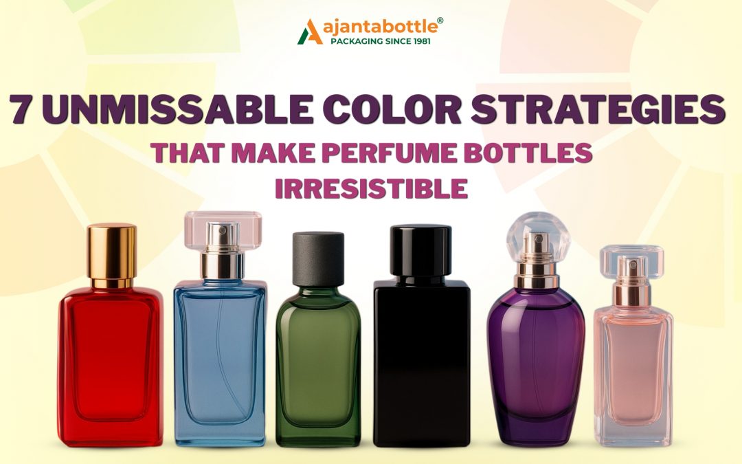
In the fragrance industry, the first impression isn’t made by scent– it’s made by sight. More specifically, by the color of the perfume bottle. Long before a consumer uncaps a perfume or sprays a tester, the packaging color communicates the mood, emotion, and identity of the fragrance. Whether it’s a romantic blush-pink bottle or a mysterious deep-black flacon, color serves as the silent language of brand storytelling in the competitive fragrance market.
Color is not merely decorative. It is a strategic marketing tool, guiding consumers in split-second decision-making, particularly in retail environments and online shopping. It has the power to evoke feelings, trigger memories, and influence purchases- often before the fragrance is even sampled.
Color is Not Just Aesthetic- It’s a Business Strategy
According to a 2023 McKinsey consumer insight report, over 68 percent of perfume purchases are influenced by packaging design and color alone, especially in digital marketplaces and gifting contexts. This statistic underscores a vital truth: most customers buy perfumes without smelling them. In these instances, the bottle becomes a symbol of what’s inside, the promise of a sensory experience.
Color creates a perceptual shortcut. In milliseconds, it helps a consumer assess
Is this scent fresh or seductive
Is it appropriate for gifting
Does it match their personality or mood
Is it daywear, nightwear, unisex, or seasonal
Failing to align your perfume bottle color with your fragrance narrative can result in a lost opportunity, no matter how exquisite the scent.

Breaking Down Color Psychology in Perfume Packaging
Below is a deep dive into how specific colors influence consumer behavior and brand positioning in the premium fragrance space
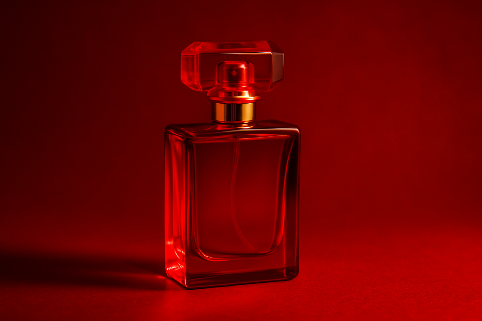
🔴 Red- Passion, Energy, Sensuality
Red bottles evoke intensity, seduction, and confidence. This bold hue is ideal for evening perfumes, spicy blends, and romantic lines.
Best suited for
Luxury and evening perfumes
Limited edition launches
Valentine’s Day gifting
Exotic floral oriental profiles
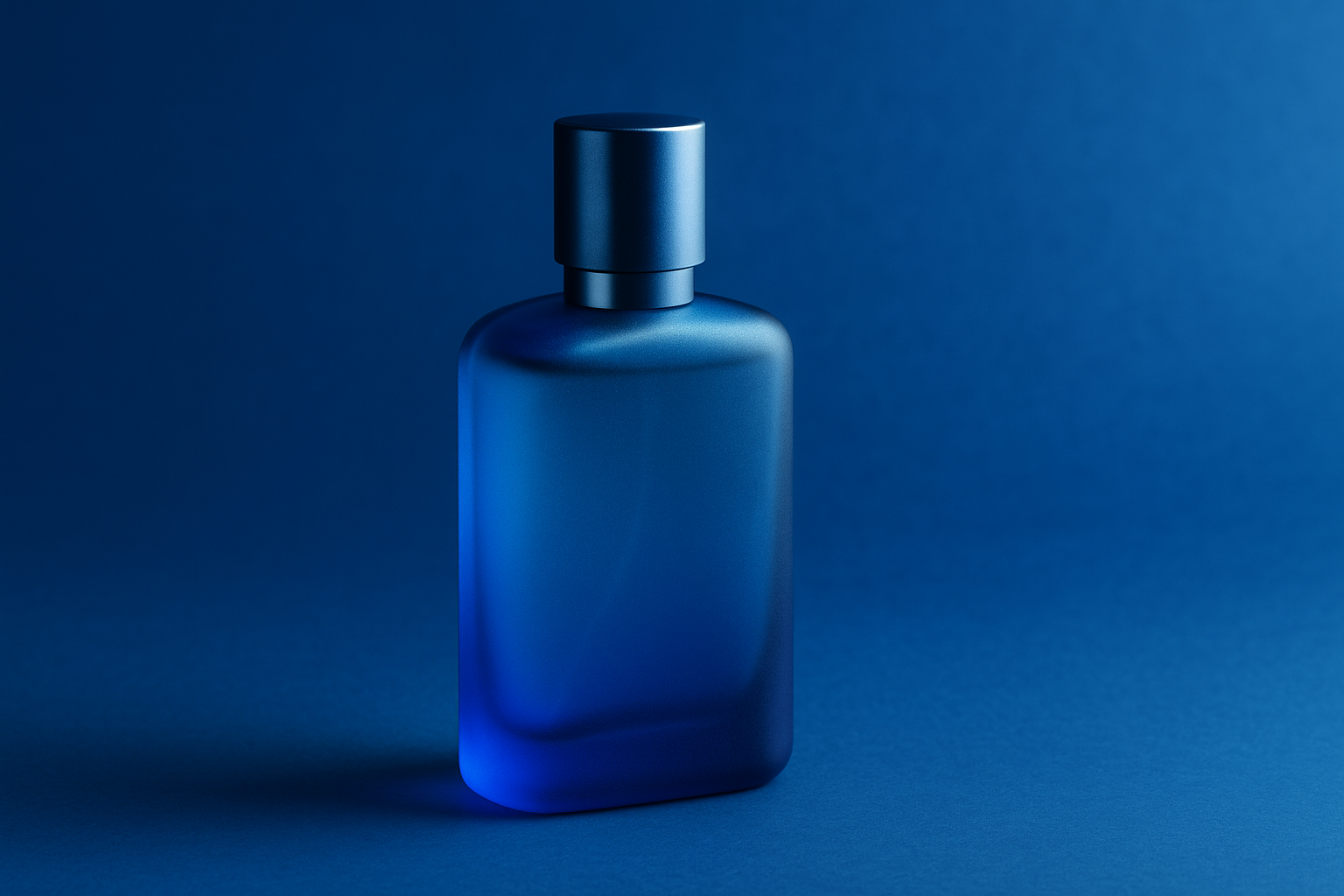
🔵 Blue- Cleanliness, Coolness, Refreshment
Blue signifies water, clarity, and calm. It is ideal for marine, sporty, or citrusy notes.
Best suited for
Unisex or men’s fragrances
Summer collections
Daytime mists
Practical Tip
Blue bottles often blend into retail shelving. Enhance their visibility using matte frost finishes or contrasting metallic details.
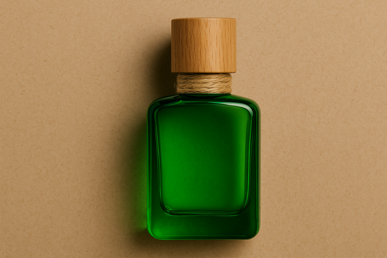
🟢 Green- Nature, Wellness, Sustainability
Green appeals to eco-conscious consumers and indicates herbaceous, woody, or clean fragrances.
Best suited for
Natural aromatherapy blends
Organic skincare and perfumes
Unisex offerings
Design Strategy
Complement green glass with earth-toned typography, wooden caps, and jute collars. Sustainability messaging requires cohesion in materials, not just color.
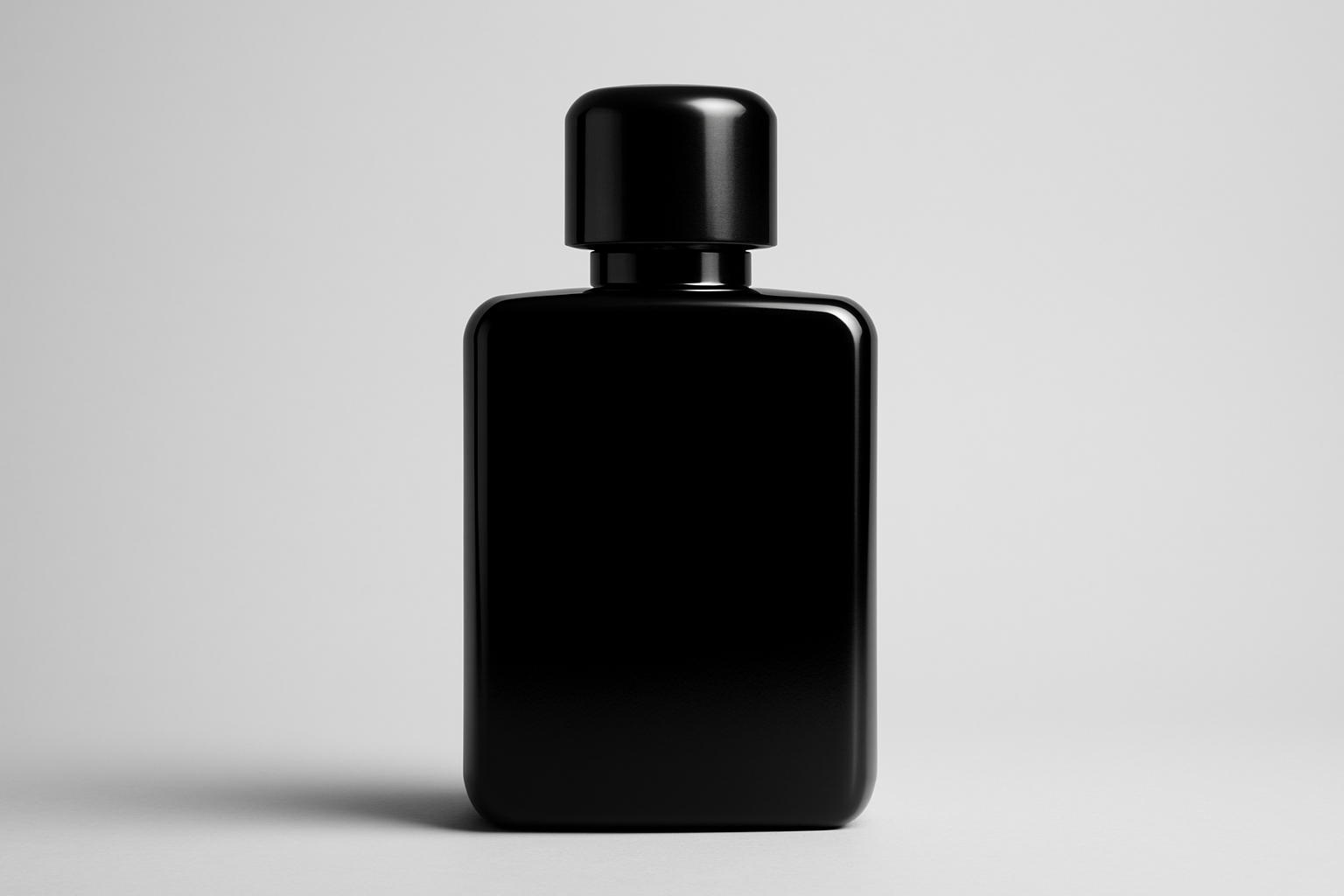
⚫ Black- Power, Prestige, Enigma
Black projects exclusivity, depth, and luxury. Matte and glossy blacks are both highly effective.
Best suited for
Oud and incense-based perfumes
High-end gifting formats
Gender-neutral or masculine lines
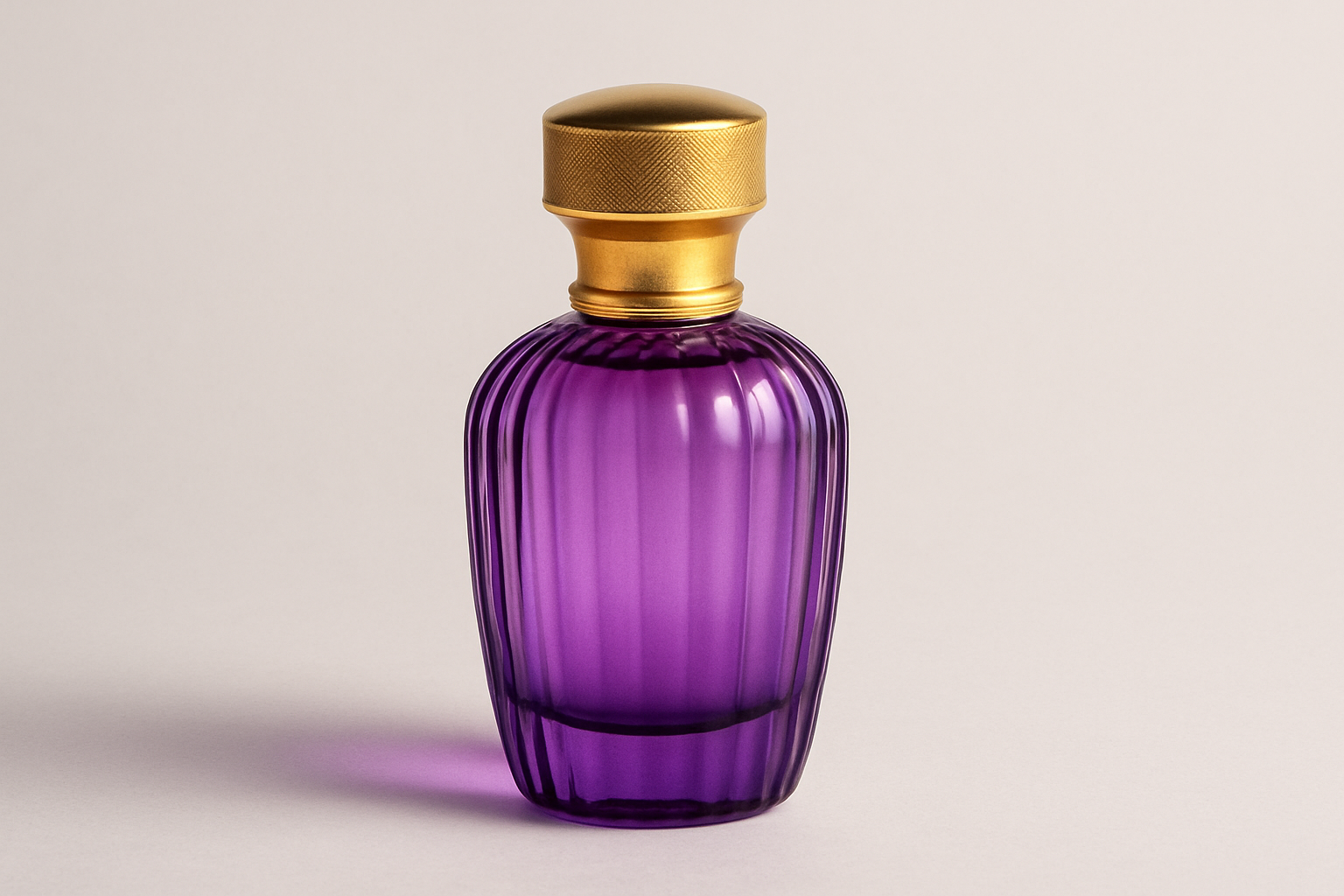
🟣 Purple- Creativity, Luxury, Femininity
Purple represents royalty, imagination, and opulence.
Best suited for
Anniversary editions
Powdery floral blends
Boutique collections
Pro Tip
Pair with gold or silver foil accents and choose ribbed or fluted small glass bottles for added elegance.
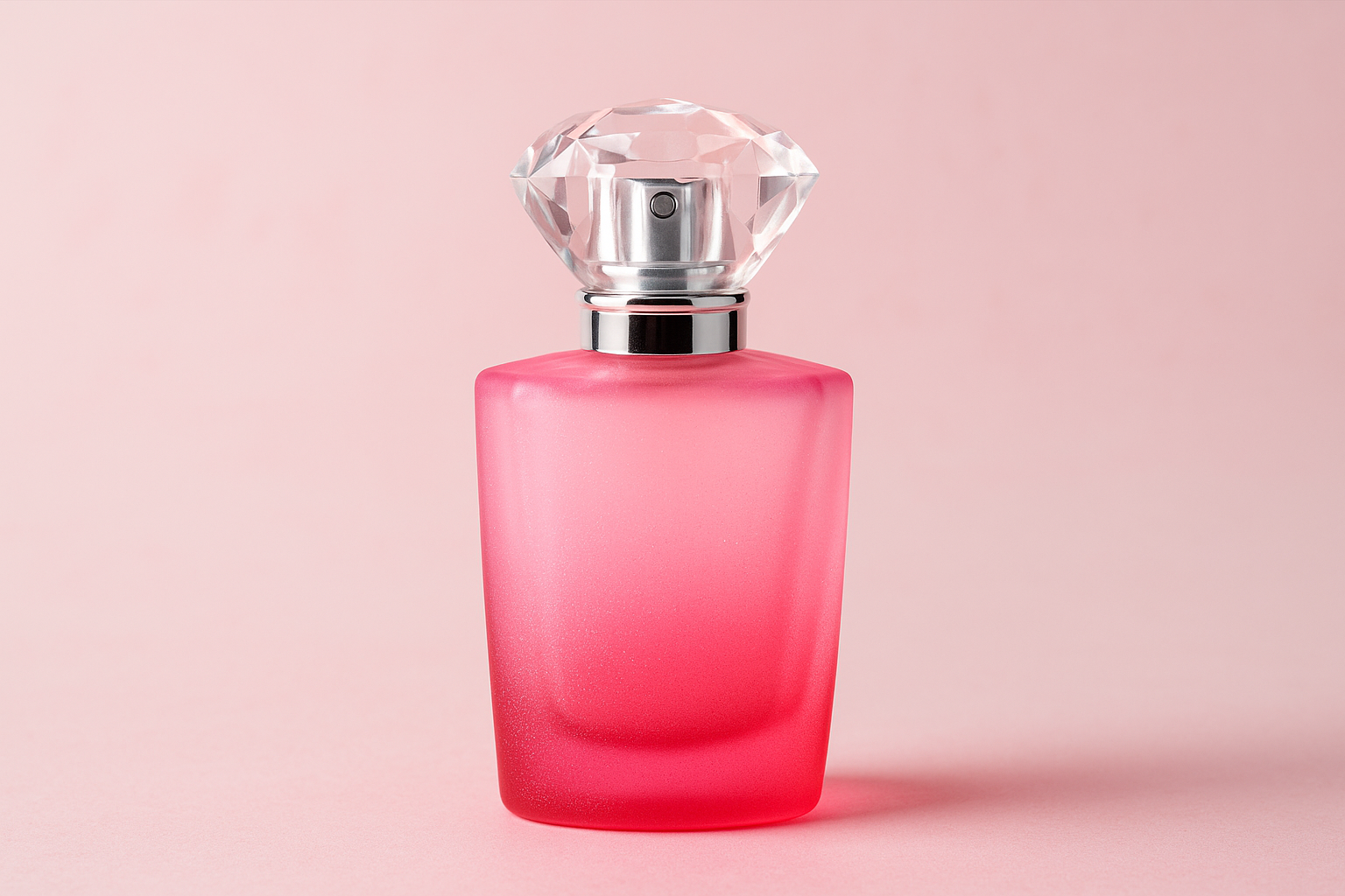
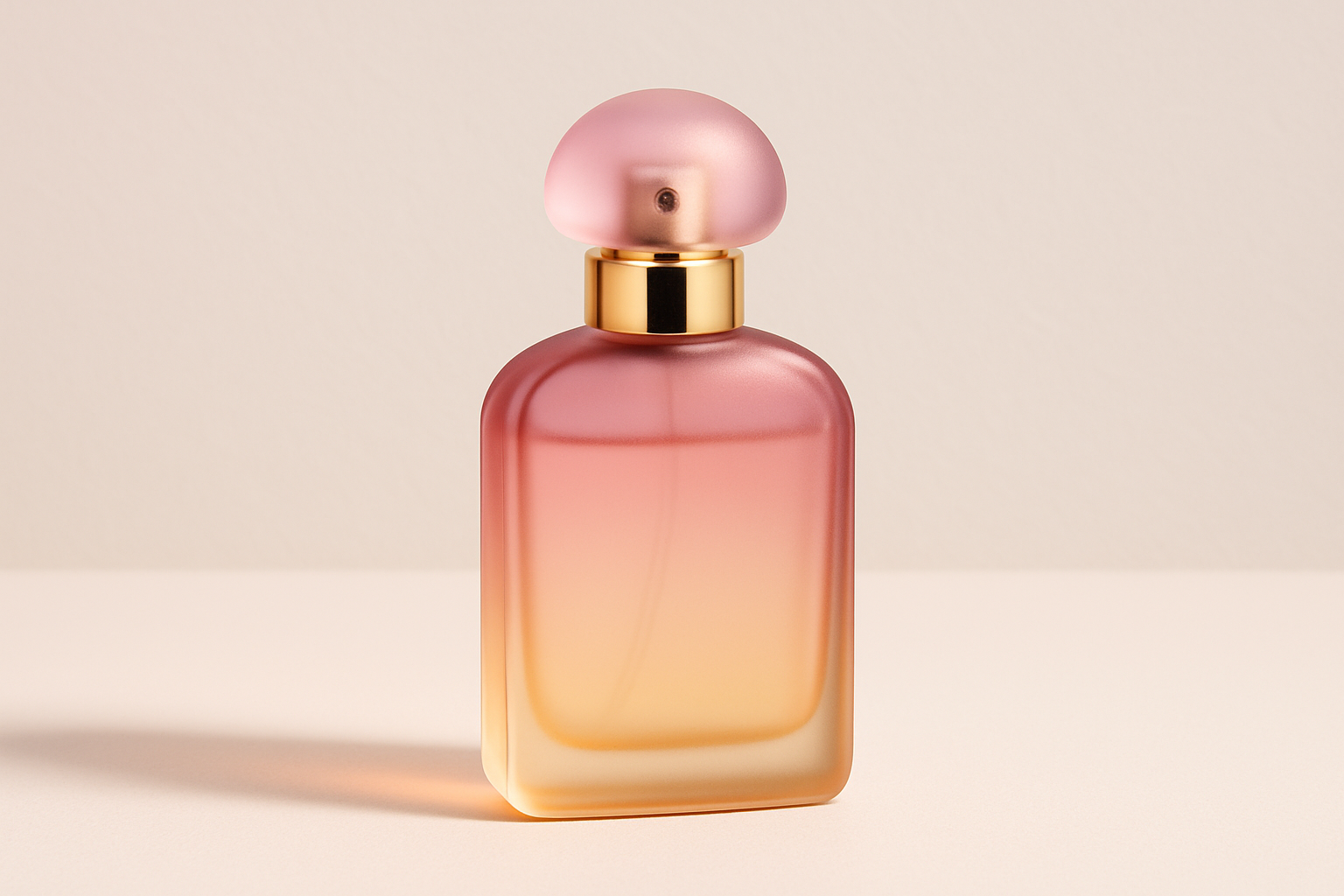
🌸 Pink- Romance, Softness, Youthfulness
Soft pink evokes innocence and flirtation. It works well with fruity, floral, and powdery notes.
Best suited for
Body mists and light fragrances
Teen and young adult lines
Romantic or spring-inspired perfumes
Design Note
Gradient frosts, crystal-like caps, or subtle sparkles enhance the luxury quotient without making the bottle look generic.
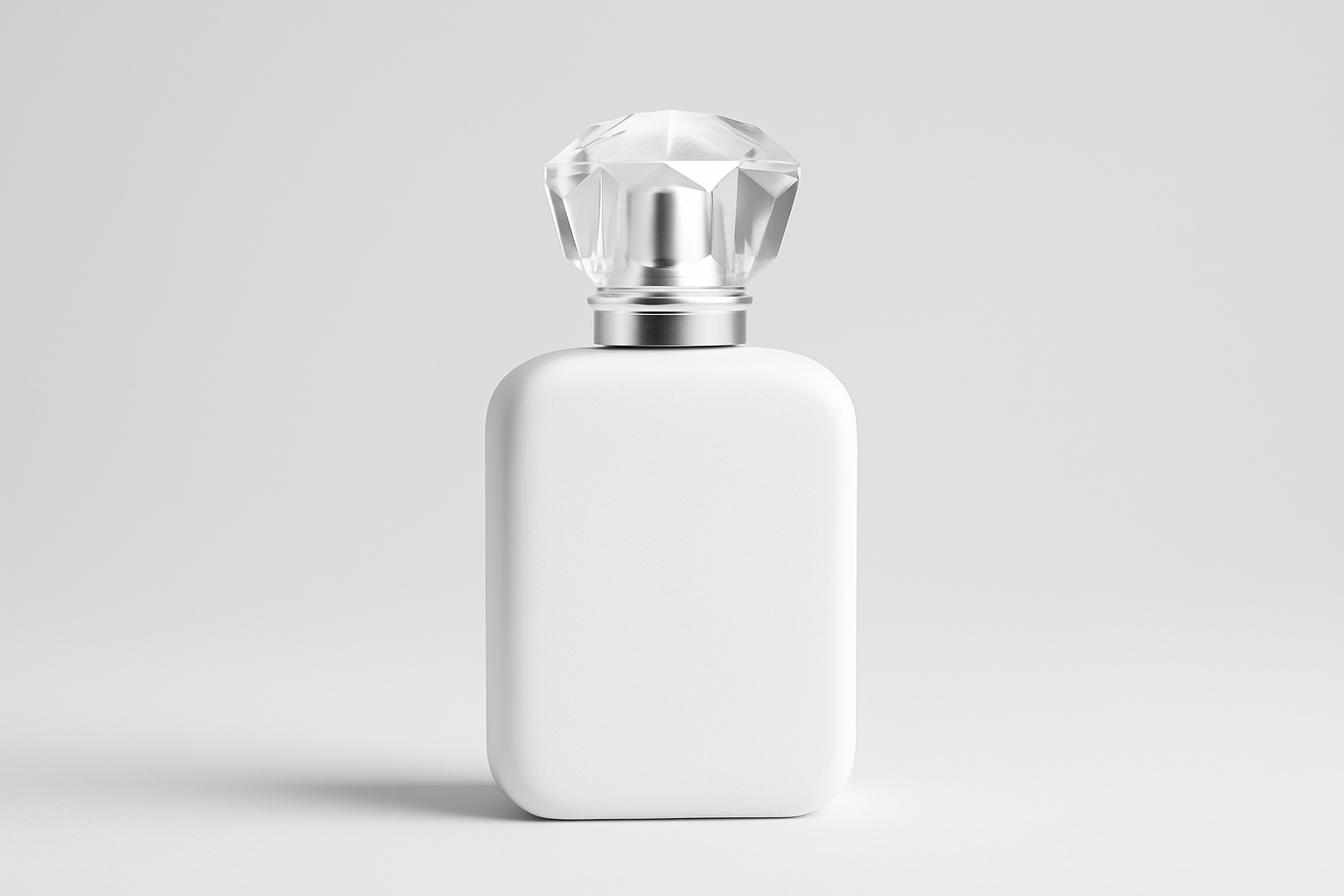
🤍 White or Clear- Purity, Simplicity, Transparency
Clear and white bottles convey freshness and authenticity.
Best suited for
Vegan or clean-label brands
Niche artisanal perfumers
Gender-neutral summer fragrances
Caution
Transparent bottles reveal everything from oil residue to finger smudges. Ensure high filling precision and airtight sealing to maintain aesthetics and performance.
Gradient Color Techniques and Two-Tone Designs: A Journey Told in Layers
In the world of perfume packaging, gradient and two-tone designs are some of the most powerful visual storytelling tools. These design elements do more than make a perfume bottle beautiful. They communicate transformation, duality, and the complexity of the fragrance inside. Just as a perfume unfolds in stages- top, heart, and base notes, the color transitions on a bottle mirror that sensory evolution.
Gradients involve a seamless transition between two or more colors. These transitions are fluid, soft, and atmospheric. They create motion, dimension, and depth. Two-tone bottles, by contrast, use clearly defined color separations to tell a story of contrast or layering. Both techniques allow brands to create packaging that feels dynamic, multi-sensory, and emotionally engaging.
Popular Gradient Color Pairings and Their Emotional Storytelling
| Gradient Transition | Emotional Message | Ideal Use Case |
|---|---|---|
| Clear to blush pink | Romantic awakening and softness emerging from clarity | Rose-based perfumes, bridal editions |
| Blue to purple | Freshness evolving into elegance and mystery | Floral-marine blends, seasonal hybrids |
| Green to amber | Natural freshness blending into warmth and spice | Herbal or Ayurvedic lines, autumn releases |
| Gold to red | Celebration, energy, and passion | Holiday collections, gifting editions |
| Lavender to white | Spiritual balance, calmness, and peace | Meditation-inspired or chakra-aligned fragrances |
| Black to transparent | Mystery giving way to honesty and simplicity | Oud blends, dual-note perfumes |
Execution Tips for Gradient Perfume Bottles
- Use minimalist branding
Gradients already carry a lot of visual weight. To avoid clutter, pair with restrained typography and avoid large or complex labels. White, black, or metallic ink directly printed on glass creates an elegant, modern finish. - Choose caps that align with the color story
The cap is part of the visual journey. Choose one that matches either the beginning or the end of the gradient. For example, a clear-to-rose bottle can use a soft gold or transparent cap. Avoid harsh contrasts unless intentionally part of your brand identity. - Pay attention to placement of labels or logos
If your gradient moves from dark to light, place the logo or text where contrast is highest to ensure readability. Transparent labels or UV-printed logos allow the gradient to remain uninterrupted. - Consider the direction of the gradient
Vertical gradients suggest time and progression, such as a morning-to-evening transition. Horizontal gradients can evoke balance and duality. Diagonal gradients create energy and modernity, especially when paired with unconventional perfume bottle shapes. - Enhance gradients with surface texture
Ribbed glass, fluted edges, or faceted cuts refract light along the gradient, adding complexity and a tactile experience that further elevates the perfume bottle’s presence.
Two-Tone Perfume Bottles: A Study in Contrast
Two-tone bottles offer a clear and bold way to communicate duality. Instead of blending colors, they separate them- often using a visual divider such as a metallic ring, a texture shift, or a mold line in the perfume bottle design. This approach suggests contrast, layering, or a dual personality, much like perfumes that combine fresh top notes with deep, woody bases.
Two-tone designs are especially effective for branding purposes. They provide immediate visual interest and allow for symbolic storytelling. For instance
-
A black lower half with a rose-gold top may represent power meeting romance
-
A clear top with a forest green base could indicate a fresh opening transitioning to an earthy dry-down
-
A pastel pink neck on a white bottle signals purity with a touch of charm
These bottles often appeal to niche fragrance lovers who are drawn to innovation, design craftsmanship, and bottles that stand out in a collection.
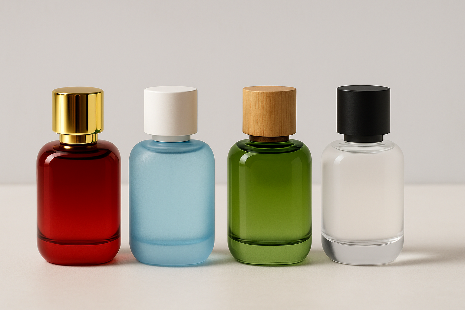
Perfume Bottle Caps and Closures: Completing the Color Story
While the perfume bottle captures attention, the cap completes the design. It is not merely a functional piece but a powerful part of the brand’s emotional message. A well-matched cap reinforces the perfume’s mood, elevates the perceived value, and enhances the customer’s tactile experience.
-
Color Coordination and Visual Impact
The cap should either complement the perfume bottle’s color or create a deliberate contrast that enhances its presence. Common and effective combinations include
-
Gold caps with deep red or black bottles for a luxurious and bold impression
-
White caps with blue or pastel-toned perfume bottles for a clean and minimalist feel
-
Wooden or cork caps with green or amber bottles for natural or earthy branding
-
Matte black caps with transparent or frosted bottles for a refined and modern look
Each pairing adds coherence to the overall design, reinforcing the emotional language communicated through color.
-
Shape and Texture Influence
The shape and surface of the cap also matter. Dome-shaped caps with a soft matte finish convey elegance and balance. Ribbed or crystal-inspired caps add sparkle and work well for playful or feminine fragrances. Metallic or brushed caps feel sleek and modern, ideal for urban or unisex lines. Heavier caps, regardless of material, signal premium quality and create a satisfying user experience.
Color with Fragrance Notes
Here’s how to align color psychology with what’s inside:
| Color | Scent Family | Mood Conveyed |
|---|---|---|
| Pink | Floral, fruity | Romantic, joyful |
| Green | Herbal, woody | Grounded, natural |
| Blue | Aquatic, mint, citrus | Fresh, energetic |
| Black | Oud, incense, leather | Bold, luxurious |
| Gold | Amber, musk, patchouli | Exotic, opulent |
| White/Clear | Clean aldehydes, fresh florals | Honest, minimalist |
Cultural and Seasonal Strategy in Color Usage
Color preferences are not universal. What appeals to a consumer in Paris might not resonate with a buyer in Mumbai or Dubai. Understanding regional color associations and seasonal expectations allows perfume brands to tailor packaging that feels culturally relevant and emotionally aligned with local buyers. For global brands or export-oriented lines, this kind of insight is essential for building trust and driving preference.
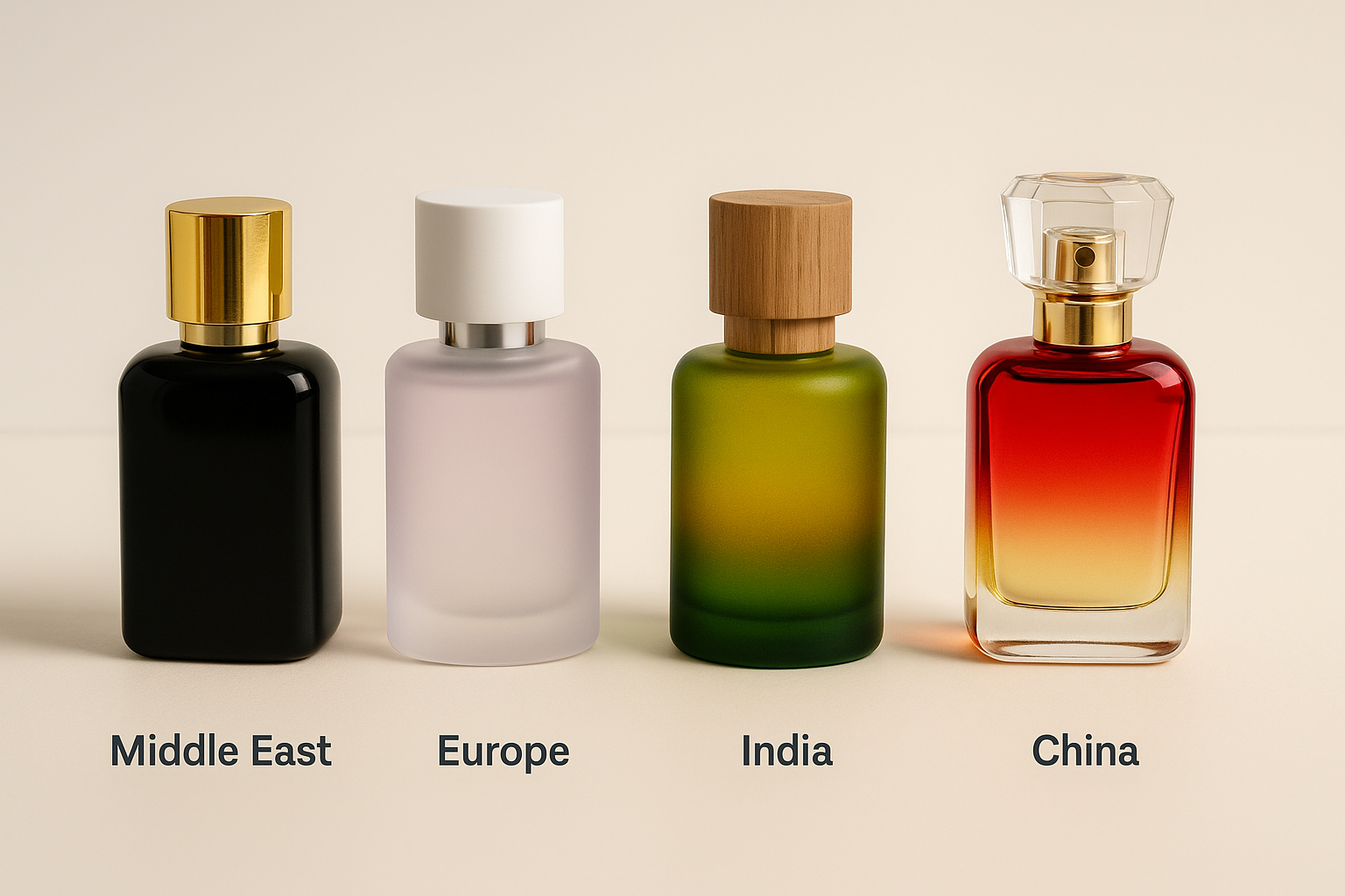
Cultural Preferences and Market Sensitivity
Fragrance is deeply personal, but packaging is where cultural cues play their biggest role. Colors carry symbolic meanings that differ significantly across regions.
-
Middle East
In Gulf countries and surrounding regions, black and gold are symbols of power, heritage, and luxury. Oud-based perfumes and concentrated attars are often housed in opaque black bottles with golden embellishments, reflecting exclusivity and sophistication. Jewel-toned glass like emerald, sapphire, and deep burgundy is also popular, especially during Ramadan or Eid gifting seasons. -
Europe
Western European markets gravitate toward pastel tones, nudes, and understated palettes. Lavender, dusty rose, soft ivory, and cool grays dominate the shelves, especially in France, Italy, and the UK. These colors are perceived as chic, minimal, and timeless. Clear bottles with soft gradients or transparent finishes perform well in niche perfumery and department store offerings. -
India
India’s visual culture is vibrant and symbolic. Colors like saffron, green, maroon, and red have festive, spiritual, or seasonal significance. For example, red and gold are highly favored for gifting during weddings or Diwali. Brands that align limited edition bottles with traditional color meanings during Navratri, Holi, or Raksha Bandhan tend to create stronger emotional connections with buyers. -
China
In China, red represents happiness and celebration, while gold is associated with wealth and success. Perfume brands launching around the Lunar New Year often adopt these hues in packaging to align with gifting traditions. Limited editions in red glass with golden embossing or decorative symbols such as dragons or floral motifs are seen as culturally respectful and commercially smart.
Understanding these nuances allows for seasonal campaigns, export-specific designs, and targeted promotions that go beyond fragrance notes into visual storytelling.
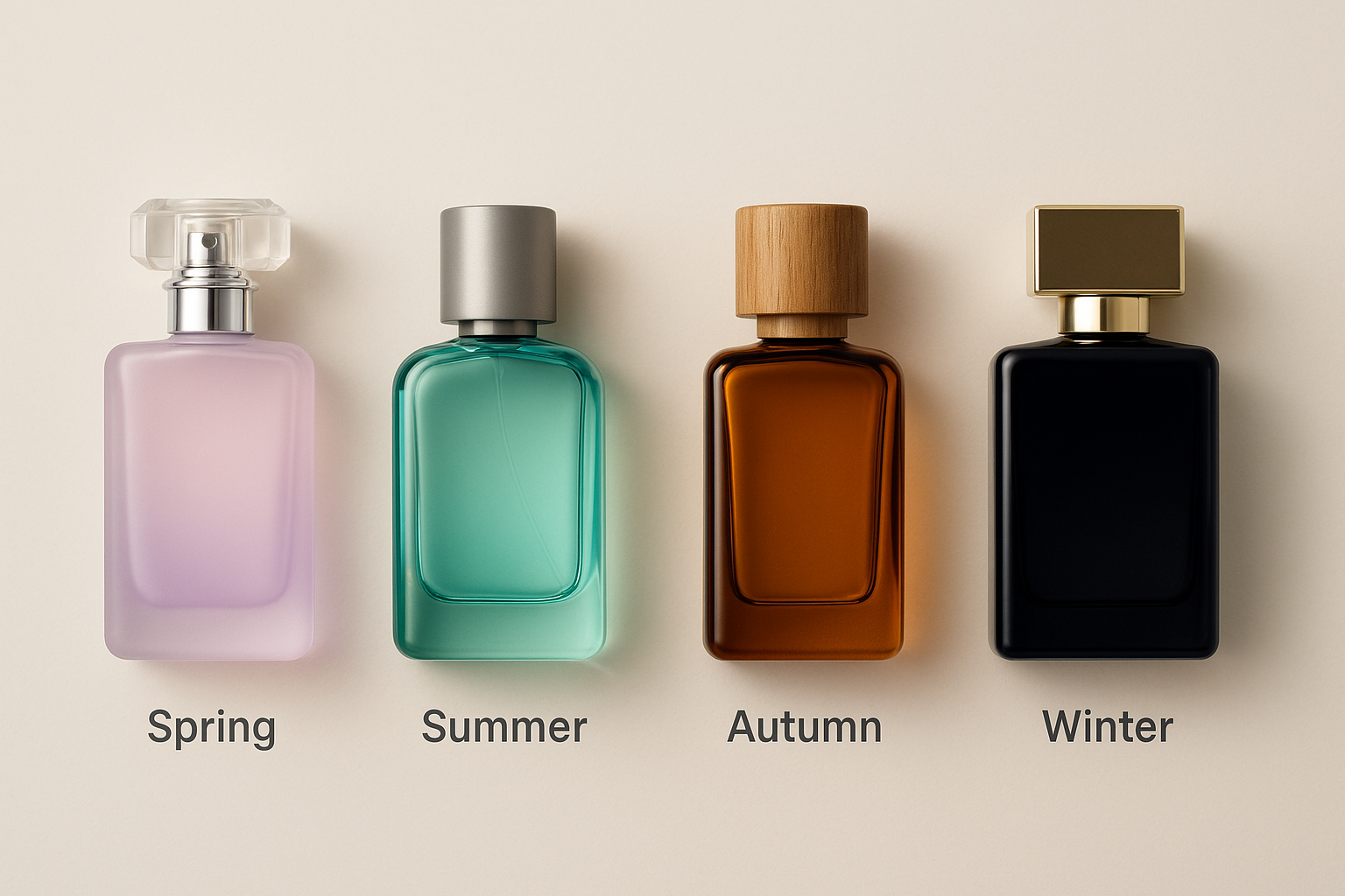
Seasonal Adjustments and Visual Seasonality
Just as fashion and flavors shift with the seasons, so do color preferences in fragrance packaging. Aligning your bottle’s visual identity with the season not only keeps your offering relevant but also helps guide consumers toward seasonal scent choices.
-
Spring
Spring is associated with renewal, softness, and subtlety. Packaging in pastel pinks, soft purples, pale greens, and clear frosted glass evokes blooming flowers, morning dew, and fresh beginnings. These colors pair well with floral fragrances, especially peony, cherry blossom, and jasmine blends. -
Summer
Summer packaging celebrates brightness, lightness, and energy. Think citrus yellows, seafoam greens, turquoise blues, and coral oranges. These vibrant shades are ideal for aquatic, fruity, or zesty fragrances. Transparent or gradient glass bottles with cooling undertones help convey the refreshment of summer sprays. -
Autumn
Autumn calls for richness and warmth. Packaging trends lean toward amber, burnt orange, copper, deep brown, and olive green. These colors reflect falling leaves, cozy evenings, and spicy gourmand scents. Matte finishes, wooden caps, and earthy tones work well to connect the scent with the season’s mood. -
Winter
Winter is the season of opulence and elegance. Packaging in black, midnight blue, plum, silver, and metallic gold communicates depth, mystery, and holiday luxury. These colors are ideal for bold compositions like oud, musk, incense, and amber. Glossy finishes and embossed textures add sophistication for holiday gifting and year-end special editions.
Avoiding Common Mistakes in Perfume Bottle Color Strategy
1. Following Color Trends That Don’t Fit Your Brand
What goes wrong: A trendy coral shade may grab attention but can dilute your brand’s identity if it clashes with your established aesthetic.
What to do instead: Anchor your color strategy in your brand personality and fragrance story. Choose shades that resonate with your long-term vision.
2. Overusing Decorative Effects
What goes wrong: Too much metallic foiling or layered gradients can confuse the eye and make your labels hard to read, especially on smaller bottles.
What to do instead: Maintain clarity and visual hierarchy. Use decorative accents sparingly to enhance, not overwhelm, the core design.
3. Ignoring Digital Appearance
What goes wrong: Colors like lilac or soft beige may look sophisticated in hand but appear dull or washed out on digital screens.
What to do instead: Test packaging under multiple lighting conditions and screen types before launch. Consistency across print and digital touchpoints is crucial.
Smart Tips for Choosing Perfume Bottle Colors
-
Match the Bottle to the Scent’s Mood
Align the emotional feel of the fragrance with its packaging:
-
- Soft lavender or pink for floral and powdery scents
- Deep green for herbal, forest-inspired fragrances
- Glossy black or burgundy for bold evening wear
- Clear or white for light summer perfumes or niche collections
-
Consider Sales Channels
In retail stores: Use richer hues that catch the eye and stand out on shelves.
In online sales: Avoid colors that blend into white backgrounds. Choose shades that retain contrast and richness in thumbnails and lifestyle photos.
-
Test in Multiple Lighting Conditions
Evaluate your perfume bottle design in:
-
- Natural daylight
- Retail store lighting
- Soft room light
- Digital screens
Ensure your chosen color performs consistently across all environments.
-
Ensure a Unified Packaging Look
The bottle, cap, pump, and label should feel like one cohesive unit:
-
- Mismatch between cap quality and bottle finish can reduce perceived value.
- Fonts, logo placements, and embellishments must support the visual tone of the bottle’s color.
-
Know Your Target Audience
- Younger consumers may gravitate toward fun or pastel tones.
- Luxury buyers expect refinement in black, gold, or metallics.
- Eco-conscious customers prefer muted, earthy tones that suggest natural values.
-
Use Color to Build Your Perfume Collection Structure
If your brand is launching multiple fragrances in one series:
-
- Use one common bottle shape
- Vary only the bottle color or cap tone
- Let the color of the perfume bottle communicate the fragrance profile inside
Example:
-
- Pink for rose
- Yellow for citrus
- Sea green for aquatic notes
- Brown for wood and oud
This approach maintains visual consistency while making it easy for customers to navigate the range.
Decorative Techniques That Amplify Color Psychology
Color choice is foundational, but decoration brings it to life. Here are the most impactful decoration methods that elevate a perfume bottle’s visual and emotional appeal:
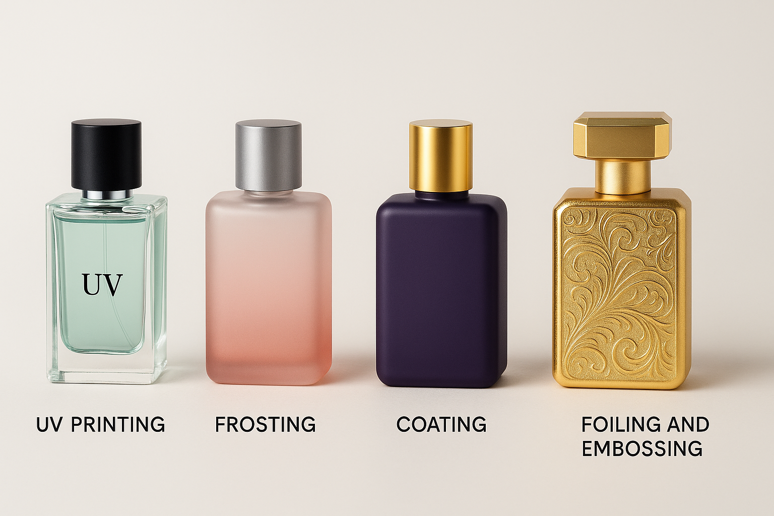
UV Printing
- Prints logos and branding directly on the glass using durable UV inks
- No label required
- Clean, minimalist effect
- Supports both bold and understated designs
Frosting
- Creates a matte, diffused look
- Softens the appearance of strong colors
- Hides fingerprints and surface flaws
- Feels premium and tactile
Coating
- Adds a custom color or texture to the perfume bottle using various finishes
- Glossy for vibrance
- Matte for elegance
- Metallic for drama
- Pastel for softness
Foiling and Embossing
- Metallic foils add shine and draw attention
- Embossing creates raised textures for a tactile premium feel
Both enhance brand recall and elevate luxury perception
Case Studies: Packaging Color in Action
-
Le Labo – Minimalism as a Premium Statement
Visuals Transparent bottles, muted beige labels, black monospaced fonts
Psychology Honesty, authenticity, quiet luxury
Impact Maintains $200 plus pricing while achieving cult status
-
Carolina Herrera “Very Good Girl” – Red Done Right
Visuals Red stiletto-shaped bottle
Psychology Flirtation, bold femininity, celebration
Impact Outsold its predecessor in Latin America and Middle East. Dominated holiday gifting
-
Tom Ford “Noir” – The Power of Black Consistency
Visuals Black ribbed bottles with silver accents
Psychology Masculine, exclusive, seductive
Impact Built strong identity across product family, increased shelf recognition
Conclusion: Let Your Perfume Bottle Speak Before the Scent
In the fragrance world, scent may be the soul, but color is the first voice. It captures the eye, sets the emotional tone, and builds anticipation before a single note reaches the skin. From the romantic softness of blush pink to the commanding depth of matte black, color tells your perfume’s story in a language every customer understands instinctively.
More than a design detail, color is a strategic tool. It drives perception, guides decisions, and connects your brand to your buyer. When paired with thoughtful decoration, texture, and finishing, the right color transforms a simple glass bottle into a sensory experience and a marketing asset.
As the fragrance market continues to evolve with growing digital purchases, conscious consumers, and competitive shelves, packaging that is emotionally intelligent and culturally aware will continue to lead.
Ajanta Bottle: Packaging That Feels as Good as It Looks
At Ajanta Bottle, we believe every great fragrance deserves a bottle that captures its essence at first glance. With over four decades of packaging expertise, we help perfume brands turn their vision into packaging that speaks, sells, and stays memorable.
From color psychology consultation to premium decoration techniques such as gradient coating, frosting, UV printing, and embossing, we offer end-to-end solutions tailored to your scent, story, and strategy. Whether you’re creating a minimalist niche collection or launching a vibrant festive edition, our team will help you choose the right color palette, cap style, and finishing detail to ensure your product stands out—on the shelf and in the heart.
Your perfume is more than a product. It is a story, a memory, an emotion. Let us help you bottle that story beautifully.
Ready to create the perfect perfume bottle packaging for your brand?
Connect with us:
● Email at sales@ajantabottle.com
● Phone/Whatsapp: +91 9891098918
You can also shop from more than 500+ packaging solutions on www.ajantabottle.com – India’s first ever comprehensive packaging e-commerce portal.
For additional information, browse through our blog at https://www.ajantabottle.com/blog/ or subscribe to our latest updates through our social media channels,
*YouTube channel: https://www.youtube.com/c/Ajantabottle
*LinkedIn Page: https://www.linkedin.com/company/ajantabottle
*Facebook Page: https://www.facebook.com/glassbottleindia
*Instagram Page: https://www.instagram.com/ajantabottle
*Google Business Profile Manager: https://g.page/r/CXTH9MKpe2DuEBM/review


